FILE SETUP
How to Set Up Print-Ready Files: The Complete Checklist for Specialty Print
Trim, bleed, color, fonts, finish layers and export settings, in the order we check them. Build your file this way and it goes to press without a round trip.
By Austin Terrill · Print Peppermint · 14 min
On this page
- Trim, bleed and safety: the three lines every file needs
- Worked example: a 3.5 × 2 in card and an 85 × 55 mm card
- Document setup: the artboard is the trim, not the bleed
- Color mode: CMYK for process, named spot swatches for spot ink
- Resolution: 300 ppi at final size, 1200 ppi for bitmap line art
- Fonts: outline them or embed them completely
- Vector vs raster: every finish has to be vector
- Finish layers: one layer per operation, 100% of one named spot swatch, overprint
- The reserved swatch names
- Overprint, knockouts and separations
- One path, one swatch
- Export: PDF/X-4, spot colors intact, bleed on, no crop marks
- Double-sided files: one PDF, front on page 1, back on page 2
- File naming: what it is, what size, which version
- What happens at our proof stage
- The preflight checklist
- Which guide next
A print-ready file is a PDF built at the finished size of the piece, with 3 mm (0.125 in) of bleed on every edge that touches art, CMYK for process color, named Pantone swatches for spot ink, images at 300 ppi, fonts outlined, and every finish (foil, emboss, spot UV, cuts) drawn as vector on its own layer in 100% of one named spot swatch, set to overprint. Export it as PDF/X-4. That is the whole job. The rest of this guide is how to do each part, and why the press needs it that way.
Here's the landmine first. Most files we send back don't fail on color or resolution. They fail on finish layers: a foil logo built out of rich black, an emboss sitting on the same layer as the ink, a die line drawn as a filled shape. If you only have five minutes, read the finish layers section and the preflight checklist at the end, in that order.
Trim, bleed and safety: the three lines every file needs
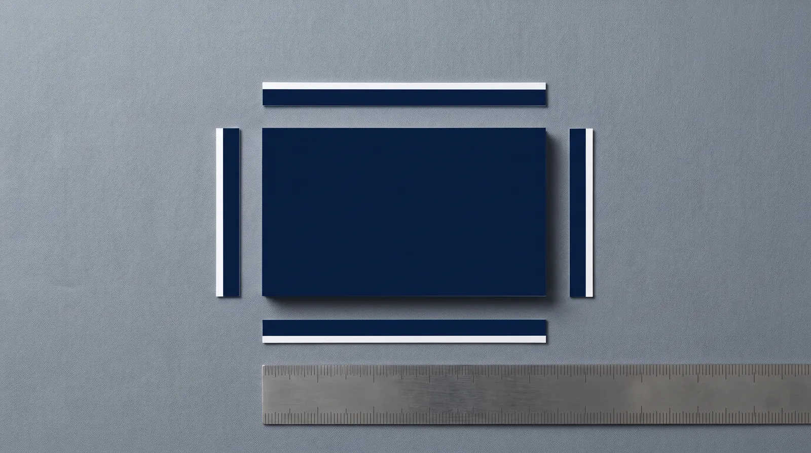
Every file has three boundaries. Trim is where the blade cuts. Bleed is 3 mm (0.125 in) outside trim, and any background, photo or color that touches the edge has to reach it. Safety is 3 mm (0.125 in) inside trim, and every piece of copy, every logo and anything else that must not be clipped stays inside it.
The reason is the stack. We cut stacks of sheets, not single cards, and across a stack the blade lands within ±0.8 mm (±0.03 in) of the trim line. When it lands outside, bleed means the edge still shows art, not a white sliver. When it lands inside, safety means the blade misses your phone number.
| Item | House spec | Why it exists |
|---|---|---|
| Bleed, paper and board | 3 mm (0.125 in) on every side that touches the edge | Covers the cut tolerance so no white edge shows |
| Bleed, metal cards | 1 mm | Metal, plastic and wood follow their own spec |
| Safety margin | 3 mm (0.125 in) inside trim | Keeps copy and logos clear of the blade |
| Safety, metal cutouts | 2 mm from the outer edge | Keeps cutouts clear of the outer edge |
| Cutting tolerance | ±0.8 mm (±0.03 in) across a stack | The reason bleed and safety exist |
Some online printers ask for 1–2 mm of bleed. We ask for 3 mm. More bleed than a printer needs is harmless; less is a reprint. Card and invitation dimensions are in the size guide.
Worked example: a 3.5 × 2 in card and an 85 × 55 mm card
| US card | EU card | |
|---|---|---|
| Artboard (= trim) | 3.5 × 2 in (88.9 × 50.8 mm) | 85 × 55 mm |
| Bleed, each side | 0.125 in | 3 mm |
| PDF page with bleed | 3.75 × 2.25 in | 91 × 61 mm |
| Safety line, inset from trim | 0.125 in | 3 mm |
| Safe area for copy | 3.25 × 1.75 in | 79 × 49 mm |
Metal, plastic and wood cards are ISO 7810 ID-1, 85.6 × 53.98 mm, with 1 mm bleed and a 3 mm corner radius.
Document setup: the artboard is the trim, not the bleed
Set the artboard or page to the finished trim size, and add bleed in the document settings. Don't make the artboard bigger to leave room for bleed.
- Illustrator: File > Document Setup > Bleed, 3 mm (or 0.125 in) on all four sides. The red bleed guide appears outside the artboard.
- InDesign: File > Document Setup > Bleed and Slug, 3 mm on all four sides.
- Affinity Designer and Publisher: Document Setup > Bleed, 3 mm on all four sides.
Why it matters: a PDF carries a trim box and a bleed box. Build the artboard at trim, set bleed in the document, and both come out right on export. Build the artboard at 3.75 × 2.25 in instead and the PDF says your card is 6 mm larger than it is, so every measurement we check starts from the wrong edge.
Color mode: CMYK for process, named spot swatches for spot ink
Build full-color art in CMYK and every spot ink as a named Pantone swatch. No RGB, no Lab. Every conversion moves color, so do it yourself, where you can see the result.
Pick Pantone references from the right book: Uncoated (U) for uncoated and cotton stock, Coated (C) for coated. C and U are the same ink; uncoated paper absorbs it, so the color reads flatter and darker, and the U swatch is the honest preview. More in spot color and Pantone.
| Element | Build it as | Rule |
|---|---|---|
| Photos and full-color art | CMYK | Total ink 300% maximum |
| Brand color on uncoated or cotton | Named Pantone U swatch | One swatch per ink |
| Brand color on coated stock | Named Pantone C swatch | One swatch per ink |
| Small black type and fine lines | K100 only | Never rich black |
| Large black areas | Rich black C60 M40 Y40 K100 | Only for areas at least 5 mm across |
| Tints | CMYK or spot tint | Lightest tint 8% |
| Foil, emboss, UV, white ink, cuts | Reserved finish swatch | See the swatch table below |
| Anything on dark dyed-through stock | Foil or white ink | CMYK disappears on dark stock |
Why rich black stays out of small type: four plates never land in exactly the same place, and a 7 pt letter built from four inks shows colored fringes when they don't. Details in CMYK, rich black and ink limits.
And one distinction that trips up experienced designers: a finish swatch is not a color. FOIL-GOLD isn't a Pantone or a CMYK build that looks gold. It's an instruction to make a die in that shape, and its preview can be any color you can tell apart from the rest of the file.
Resolution: 300 ppi at final size, 1200 ppi for bitmap line art
Photos and other raster images need 300 ppi at the size they print. Bitmap line art (a scanned signature, a one-color logo that only exists as pixels) needs 1200 ppi, and a vector version is always better.
The phrase that matters is at final size. A 300 ppi image scaled to 200% in your layout is 150 ppi on paper; InDesign shows this as Effective PPI in the Links panel. Upsampling adds pixels, not detail, so the fix is a smaller placement or a better source.
Fonts: outline them or embed them completely
Every font is either converted to outlines or fully embedded in the PDF. A missing font gets substituted, and substitution reflows lines and can push type across the safety line.
- Type on finish layers is always outlined. A foil die or emboss die is made from paths, not from a font.
- Outline last. Keep a live-type master, make an outlined copy for print, and outline after the final text edit.
- Check it. In Illustrator or InDesign, Type > Find Font should list nothing live on the finish layers. In Acrobat, File > Properties > Fonts should show every font as embedded or embedded subset.
Vector vs raster: every finish has to be vector
Foil, emboss, deboss, spot UV, letterpress plates and cut lines are all made from vector paths, so their artwork has to be vector.
A foil die is a block of metal with your shape raised on its face. At every point on the sheet it either touches or it doesn't, so the foil is either there or it isn't. There is no 60% foil. A gradient, a shadow, a glow or a JPEG's soft edge means nothing to a die. Send raster finish art and someone has to redraw it, and whoever redraws it decides where your edge goes.
Vector also has to be big enough. No foil line, rule, outline or gap inside foil may be thinner than 0.6 mm (1.7 pt); letterpress holds 0.15 mm (0.4 pt); emboss needs 0.5 mm (1.5 pt). Every process has its own floor, all in one table in minimum line weight and type size.
Finish layers: one layer per operation, 100% of one named spot swatch, overprintTHE LANDMINE
Every physical operation gets its own layer, filled with 100% of one named spot swatch, set to overprint. An operation is anything with its own tool or pass: each foil color, each emboss, spot UV, white ink, the cut, the crease.
- One layer per operation. Gold and copper foil are two dies and two passes, so two layers: FOIL-GOLD and FOIL-COPPER. Emboss is a third, the die line a fourth.
- 100% of one named swatch. Not a tint, not a CMYK mix that looks gold on screen. The die is made from exactly what is filled with that swatch.
- Vector, outlined, no effects. Strokes outlined, type outlined, no transparency, no blend modes, no clipping masks hiding extra art.
- Overprint on, so the finish doesn't punch a hole in the art underneath.
The reserved swatch names
Name each finish swatch exactly as written below. Every shop has its own name for a die line (CutContour, Dieline, Artios_Cut). The name itself doesn't matter; matching the printer's name exactly does, because it's how the file tells prepress which plate is which.
| Swatch name | Operation | Preview color |
|---|---|---|
| FOIL-<COLOR> (e.g. FOIL-GOLD) | Hot foil, one swatch per foil | Any, clearly distinct |
| EMBOSS / DEBOSS | Blind or registered impression | Any |
| SPOT-UV / RAISED-UV | Flat or raised clear coating | Any |
| WHITE | Opaque white ink | Any |
| CUT | Die or laser cut line, 0.25 pt stroke | 100% magenta |
| CREASE | Score / fold line | 100% cyan |
| PERF | Perforation (drawn solid; spacing noted) | C100 M60 |
| KISS | Kiss cut (stickers) | C60 M100 |
| ENGRAVE | Laser engrave (fills only) | M60 Y100 |
Create each one as a spot swatch (Illustrator: Swatch Options > Color Type: Spot Color) so it exports as its own separation. The preview color only changes what you see on screen.
- CUT is a 0.25 pt stroke with no fill, on its own layer, as one continuous closed path; never a filled shape. Corners and bridges are in the die cut guide.
- Foil and emboss in register run as one combination die, so the foil art and the emboss art are the same shape. Copy the FOIL paths onto the EMBOSS layer; don't redraw them.
- Multi-level or sculpted emboss needs a grayscale depth reference (white high, black low) as well as the outline.
Overprint, knockouts and separationsAGENCY LEVEL
Set every finish object to overprint. By default a spot swatch knocks out: it removes everything beneath it from every other separation. For a finish that's almost never right. A spot UV circle on knockout cuts a hole in the photo beneath it, and the gloss lands on bare paper.
- Set it: Illustrator, Window > Attributes > Overprint Fill (and Overprint Stroke for CUT and CREASE lines). InDesign, Window > Output > Attributes.
- Check it: View > Overprint Preview in either app, or Acrobat's Output Preview, which lets you switch each separation on and off. Every finish swatch should appear as its own plate, and the CMYK plates underneath should be whole.
Foil is the one place you want bare stock underneath. Foil doesn't bond reliably over ink, so the ink under it is knocked out, and where foil meets printed ink you design a deliberate 1 mm gap, not a butt join. Draw that knockout in the art layer yourself, on purpose. Don't leave it to a swatch setting.
| Relationship | House spec |
|---|---|
| Foil to print registration | ±0.5 mm |
| Foil to foil registration | ±0.25 mm |
| Two foils that touch | Trap: second foil overlaps the first by 0.3 mm on shared edges only |
| Two foils that don't touch | 1 mm apart minimum |
| Foil next to printed ink | Ink knocked out under foil; 1 mm designed gap, no butt join |
| Foil to trim | 3 mm inside trim, or bleed 3 mm past it; never stop between 0 and 3 mm |
| Emboss to print registration | ±0.5 mm (use a combination die when foil and emboss must align exactly) |
| Letterpress color to color | ±0.3 mm; trap 0.3 mm where colors touch, otherwise 1 mm apart |
| Spot UV to print | ±0.5 mm; don't draw UV outlines that depend on a tighter fit |
Stacking several finishes on one piece has its own rules; see combining print finishes.
One path, one swatch
The dirtiest foil files are built from whatever the logo happened to be made of: a ring in rich black, a stroked K100 letter, a gradient bar, an ornament pasted from a JPEG. On screen it's one mark. To prepress it's four partial plates and no foil plate. Rebuild it: outline the strokes, redraw the pixels as paths, merge (Pathfinder > Unite), and fill with 100% of one finish swatch.
Export: PDF/X-4, spot colors intact, bleed on, no crop marks
Export a PDF/X-4 with document bleed included, spot colors kept as spot colors, and no printer's marks. PDF/X-1a is accepted, and so is a packaged native Illustrator file.
| PDF/X-4 | PDF/X-1a | |
|---|---|---|
| Our preference | Preferred | Accepted |
| Transparency | Kept live | Flattened on export |
| Layers | Kept, so finish layers stay separate | Flattened |
| Spot colors | Kept as named separations | Kept as named separations |
| Color | CMYK and spot, plus embedded ICC profiles | CMYK and spot only |
X-4 keeps layers and spot channels, which is why it's our first choice: we can check each finish on its own without taking the file apart.
- Illustrator: File > Save As > Adobe PDF. InDesign: File > Export > Adobe PDF (Print).
- Choose the PDF/X-4:2008 preset.
- Marks and Bleeds: tick Use Document Bleed Settings. Leave every printer's mark unticked.
- Output: leave color conversion off, or choose Preserve Numbers if you convert, so your CMYK values don't shift.
- InDesign only: open Output > Ink Manager and make sure All Spots to Process is unticked.
- Open the PDF in Acrobat, run Output Preview, and check that each finish swatch appears as its own separation.
We don't need crop marks. Leave printer's marks off; the PDF's trim box tells us where to cut. Sending native Illustrator instead? Use File > Package so linked images and fonts travel with it.
Double-sided files: one PDF, front on page 1, back on page 2
Send both sides in one PDF: front on page 1, back on page 2, same trim size and bleed on both. In Illustrator, that's two artboards in one document.
- Same swatch names on both sides. Foil on the back is still FOIL-GOLD, on its own layer, on page 2.
- Mixed orientation: keep both pages the same size, rotate the artwork on one, and tell us which edge is the top of the back.
- Finishes on both sides are separate dies and passes. Emboss or deboss on both sides needs duplex construction so the impressions don't telegraph through.
- Suites: one PDF per piece (invitation, RSVP, details card), not one for the whole suite.
File naming: what it is, what size, which version
Name every file so a stranger knows what it is: client, piece, trim size, sides, version, as in hollis-studio_business-card_85x55_front-back_v3.pdf. Skip final and FINAL-2. Bump the version every time the file changes; when two files share a name, somebody eventually prints the wrong one.
What happens at our proof stage
A person checks every file against the house spec before anything is made, and nothing goes to press until you approve a proof. The digital proof is free.
- We check trim, bleed, safety, color, swatches, resolution and fonts, then each finish layer against its minimums: line weights, gaps, type sizes and distances.
- If anything falls short, we tell you exactly what and show you the fix before you approve anything.
- You get a digital proof of the art with every finish called out, and nothing is made until you approve it.
- You approve, or ask for changes. Approval of the proof is approval of the file.
Read a proof the way the press will: spelling, phone numbers and email addresses letter by letter, and which elements are foil, ink or blind. More in how proofing works.
The preflight checklist
Every item here is something we check. Catch it first and your proof comes back clean.
- Artboard or page is the trim size, not the bleed size
- Document bleed set to 3 mm (0.125 in) on every side; background art reaches the bleed edge
- All copy and logos sit at least 3 mm (0.125 in) inside trim
- Process color is CMYK; no RGB or Lab objects or images
- Spot inks are named Pantone swatches, from the U book for uncoated or cotton stock
- Total ink 300% maximum; rich black only on areas at least 5 mm across
- Small black type and fine lines are K100, not a four-color build
- Raster images 300 ppi at final size; bitmap line art 1200 ppi or rebuilt as vector
- Fonts outlined or fully embedded; all type on finish layers outlined
- One layer per finish operation, named for the operation
- Each finish layer filled with 100% of one reserved swatch (FOIL-GOLD, EMBOSS, SPOT-UV, CUT…)
- Finish art is vector: no gradients, shadows, transparency or pasted pixels
- Finish swatches set to overprint; checked in Overprint Preview or Output Preview
- Ink knocked out under foil, with a 1 mm gap where foil meets printed ink
- Foil lines and gaps 0.6 mm (1.7 pt) or more; other finishes meet their minimums
- Foil sits 3 mm inside trim or bleeds 3 mm past it
- CUT line is a 0.25 pt stroke, one closed path, on its own layer
- No QR codes or barcodes on a foil layer
- Exported as PDF/X-4 (or X-1a), document bleed on, no crop marks
- Front on page 1, back on page 2, same page size
- File named with client, piece, size, sides and version
Which guide next
Each process adds its own rules. Go to the one you're printing.
- Foil: foil artwork preparation, then minimum line weight and type size for the 0.6 mm rule.
- Letterpress: letterpress file setup.
- Emboss or deboss: emboss and deboss file setup.
- Die cut or laser cut: die cut file setup and the laser cut file setup guide.
- Painted edges: edge painting design.
- Spot UV: the spot UV guide.
- Pantone inks: spot color and Pantone.
- Four-color work, rich black, ink limits: CMYK, rich black and ink limits.
- More than one finish on a piece: combining print finishes.
More on File Setup & Prepress
Minimum Line Weight and Type Size for Every Print Process: Foil, Letterpress, Emboss, UV, CMYK and Die Cut
Read guide →Spot Color and Pantone for Print: Choosing, Specifying and Curating PMS Colors
Read guide →Four-Color Process (CMYK) for Print: Rich Black, Ink Limits and Why Your Screen Lies
Read guide →Continue reading
FILE SETUP
Minimum Line Weight and Type Size for Every Print Process: Foil, Letterpress, Emboss, UV, CMYK and Die Cut
Read guide →FILE SETUP
Spot Color and Pantone for Print: Choosing, Specifying and Curating PMS Colors
Read guide →FILE SETUP
Four-Color Process (CMYK) for Print: Rich Black, Ink Limits and Why Your Screen Lies
Read guide →FILE PREP
How to Prepare Your Artwork for Foil Stamping
Read guide →FILE SETUP
How to Set Up a Die Line: Die-Cut and Custom-Shape Files
Read guide →FILE SETUP
Combining Print Finishes: What Works Together, What Doesn't, and in What Order
Read guide →Send the file. We'll check it against the house spec.
Start a custom quoteA person checks every file before it's proofed, and nothing goes to press until you approve.
File requirements · How proofing works · Minimum line weight and type size