FILE SETUP
Spot Color and Pantone for Print: Choosing, Specifying and Curating PMS Colors
What a spot ink physically is, why the U book matters on cotton, how paper color changes translucent ink, and how to build a spot palette that separates into exactly the plates you meant.
By Austin Terrill · Print Peppermint · 16 min
On this page
- What a spot color is, physically
- When spot color beats CMYK, and when it doesn't
- Pantone C vs U: the same ink on different paper
- How paper color shifts a translucent spot ink
- Metallic Pantone inks vs foil
- Tints of a spot color
- Curating a spot palette for print
- Check value before hue
- Decide how many inks you really need
- Pair the ink with the stock
- Pick a master for colors that cross processes
- How to set up spot swatches correctly
- Overprinting two spot inks
- Proofing spot color: what to expect
- Spot channels, separations and naming
- Spot channels in placed Photoshop files
- Separations Preview and Output Preview
- Finish swatches vs ink swatches
- Converting a spot color to CMYK
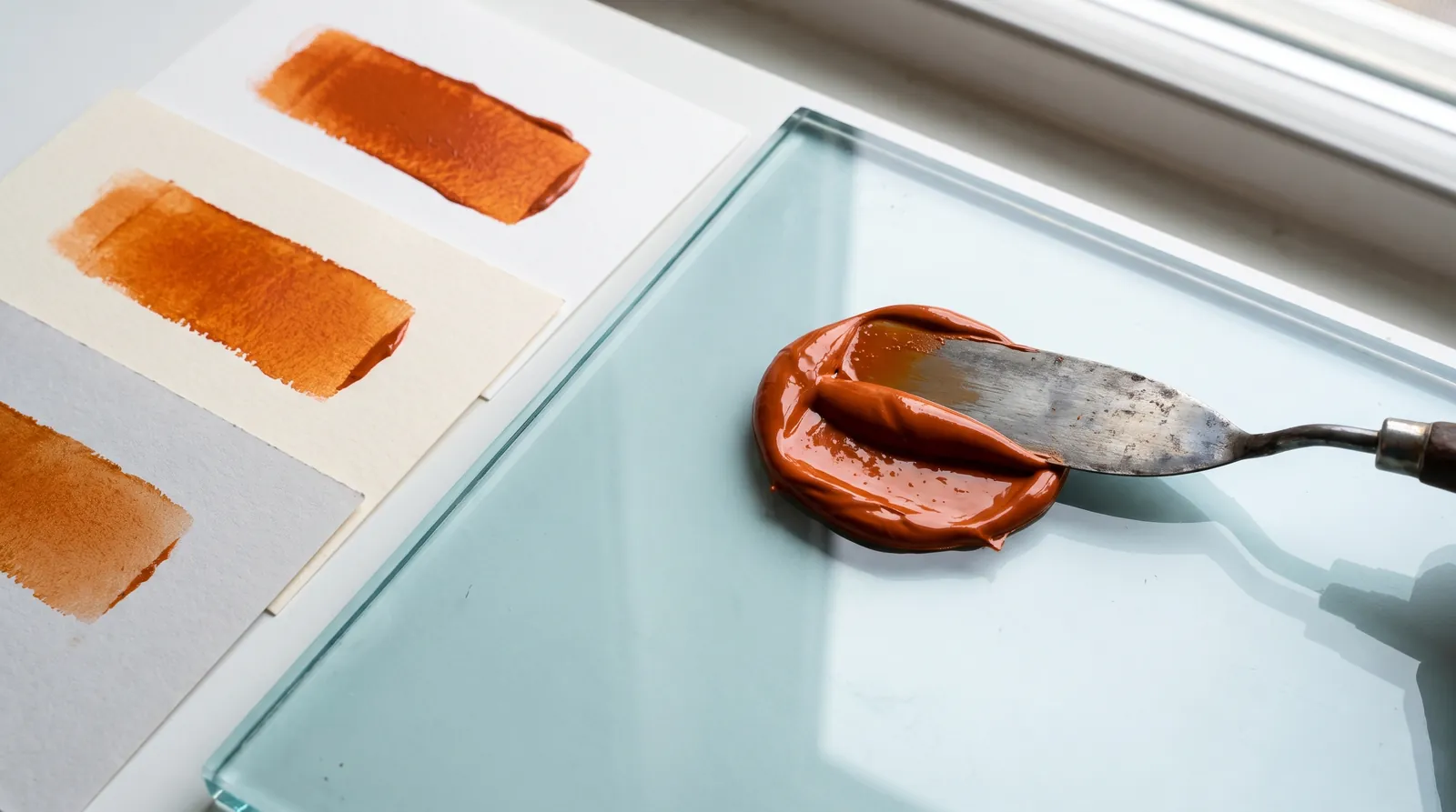
A spot color is one premixed ink, printed solid from its own plate. We mix it by hand to a Pantone number, so the color on the sheet is the ink itself, not a mix of four dots. Three rules cover most jobs: choose the number from the Pantone Uncoated (U) guide if you are printing on uncoated or cotton paper, give that swatch exactly the same name everywhere in your file, and remember the ink is translucent, so the paper color becomes part of the result.
What a spot color is, physically
A spot color is a single ink mixed before it goes on press, then printed as a solid film from one plate. That is the whole difference from CMYK. Four-color process builds a color out of tiny cyan, magenta, yellow and black dots that your eye blends; a spot ink arrives already being the color. Look at a CMYK orange through a loupe and you see a rosette of yellow and magenta dots. Look at a spot orange and you see orange.
Because each spot color is its own ink, each one gets its own plate (or letterpress plate, or screen), its own ink mix and its own pass or press unit. We hand-mix every ink to the Pantone formula, so each added spot color adds real cost, and reusing one blue for every blue element is the easiest saving there is. For how CMYK builds color with dots, see four-color process and ink limits.
When spot color beats CMYK, and when it doesn't
Use spot color when the color has to be exact, flat or impossible in CMYK; use CMYK when the artwork is a photograph or has more colors than you can afford plates for. The decision is usually obvious once you ask what the artwork is made of.
USE SPOT
A brand color that must match job to job. Letterpress, which prints one plate per color. Flat solids that would show dots in CMYK. Colors outside the CMYK range, such as clean bright orange. Fluorescent and metallic inks, which only exist as spot inks. Small colored type, which prints crisp from one plate instead of fringing from four.
USE CMYK
Photographs and continuous-tone illustration. Artwork with many colors, where four process plates beat six spot plates. Gradients and soft shadows. Short digital runs. Anything where close is good enough and the budget is better spent on paper or a finish.
There is a middle path: CMYK for the photograph, plus one spot ink for the logo. That keeps the brand color exact without converting the whole job to spot. Tell us when you quote, because it adds a plate and a pass.
Pantone C vs U: the same ink on different paper
Choose from the U guide for uncoated and cotton stock, and from the C guide for coated stock. A C chip and a U chip with the same number are the same ink formula. What differs is the paper it was printed on for the guide, and the paper changes what you see.
On coated stock the clay surface holds the ink film on top, so it dries glossy and saturated. On uncoated stock the ink wicks into the fiber, the edge spreads and the surface scatters light, so the same ink reads flatter. Cotton is more absorbent again. The U guide shows what the ink actually does on that kind of paper.
The practical trap is picking a number from the C book because it looks right, then printing it on cotton. The ink we mix will match PANTONE 2955 U, not the brighter 2955 C you fell for. If the uncoated version of your number looks too dull, don't ask us to "push" it; go back to the U guide and choose a different number that gives you the look you want on that paper. Designers who work across coated and uncoated jobs often end up with two numbers for one brand color, one per book, and that is correct practice.
How paper color shifts a translucent spot ink
Spot ink is translucent: light passes through it, reflects off the paper and passes back through it, so the paper color is always mixed into the result. On a bright white sheet you see the ink as the chip shows it. On anything else, the sheet tints it.
| Stock | What happens | What to do |
|---|---|---|
| Bright white | Ink reads as the chip | Nothing; this is the reference |
| Natural white or cream cotton | Warmer; blues lean green, cool grays warm up | Check the chip against the actual sheet, not white paper |
| Kraft or tinted stock | Darker and duller; light colors lose their brilliance | Keep inks darker than the paper, or start from white and print the background |
| Mid gray | Muddy, low contrast | Choose inks well above or below the paper's value |
| Black or dark dyed-through | Ink almost disappears | Use foil |
House rules: light ink on dark stock is not offered in letterpress, because letterpress ink is translucent; use foil. White ink on uncoated cotton is not offered; use foil or a blind deboss. See best papers for foil.
So choose the paper before you finalize the inks. And when a design carries light accent colors, a white sheet printed with a background color usually beats a tinted sheet, because the accents stay clean. That works in offset and digital. It doesn't work as a letterpress flood on cotton, which mottles above 13 cm² (2 in²); the fix there is a colored ply in a duplex construction. For a dark sheet, go straight to foil: it is opaque and sits on top of the stock. Even foil has a limit: dark foil on dark stock reads as sheen, not contrast.
Metallic Pantone inks vs foil
Metallic ink gives a soft satin sheen; foil gives a mirror. They are different materials and they don't substitute for each other. A metallic Pantone such as PANTONE 871 U is an ink with fine metallic flakes suspended in it; it prints through the same plate as any other ink and reads as a glint that moves with the light. Foil is a metal layer transferred by a heated die; it is opaque, reflective and sits on the surface.
| Metallic spot ink | Hot foil | |
|---|---|---|
| Look | Satin sheen, a little grainy up close | Mirror or matte metal, clean edge |
| On uncoated and cotton | Flakes sink with the ink; sheen drops noticeably | Sits on top; stays bright |
| On dark stock | Translucent vehicle; weak | Opaque; the standard fix |
| Fine detail | Follows the ink process minimums | 0.6 mm (1.7 pt) minimum line and gap |
| Tooling | A plate, like any spot ink | A metal die per foil, per location |
Foil minimums are covered in foil artwork preparation.
Metallic ink earns its place for a quiet shimmer on type finer than foil's 0.6 mm floor. When a brand needs a metallic version of a specific Pantone and no foil is close, a Pantone mixed with a metallic additive is our fallback. It won't look like foil. Metallic and fluorescent inks are specialty mixes that not every process runs; name them on your quote and we confirm the build.
Tints of a spot color
A tint is the spot ink broken into dots, so it inherits every limit of a halftone. A 40% tint of a blue is not a lighter ink; it's the same blue printed as a dot pattern that covers 40% of the paper. Whether that holds depends on the process.
| Process | Tint rule | Why |
|---|---|---|
| Offset and digital | No tint lighter than 8% | Smaller dots fail to print evenly and drop out |
| Letterpress | Avoid halftones; if unavoidable, 85–100 lpi and no tint under 15% | Photopolymer plates and soft paper can't hold small dots; they fill or vanish |
| Foil, emboss, spot UV | No tints at all | These print solid or not at all; a tint becomes solid |
On letterpress, if you need a lighter version of a color, mix it as a second spot ink rather than tinting the first. It costs a plate, but it prints as a clean solid with the same crisp impression as everything else. See letterpress file setup for the plate rules.
Curating a spot palette for print
Build a print palette on value contrast first, hue second, and plate count third. A palette that looks balanced on screen can collapse on paper, because the paper adds its own color and because two inks of different hue but equal lightness merge at reading distance.
Check value before hue
Convert your palette to grayscale, including the paper, and look at it. If two inks land at nearly the same gray, type in one over the other won't read, and the design will feel flat however different the hues are. Sage green and warm gray is the classic trap: two pleasant colors with almost no value difference between them.
Decide how many inks you really need
Every spot color is another plate, ink mix and pass, and every pass is another chance for registration to move. On letterpress, colors register to each other within ±0.3 mm; where two colors touch we trap them 0.3 mm, and where they don't touch they should sit at least 1 mm apart. Two inks plus a foil covers most identities well. A third ink should earn its place by doing something the first two can't.
Pair the ink with the stock
Treat the paper as a palette color with its own value. Cotton comes in a warm natural white, a bright white and a creamier ivory, and the same ink shifts across all three. Hold the U chip against the actual sheet from our paper library or a sample pack before you commit.
Pick a master for colors that cross processes
A brand color printed as spot ink, foil, edge paint and a CMYK build will never match exactly, so decide which one is the master. Each process makes color a different way. The goal is a family that reads as one color at arm's length, not four identical swatches under a loupe.
| Process | How the color is made | What to expect |
|---|---|---|
| Spot ink on paper | Ink mixed to the Pantone number | Closest to the chip on the matching paper; usually the master |
| Foil | Chosen from a fixed range of foil colors | Nearest available foil, not a mix; metallics shift with the light |
| Edge paint | Paint matched to a Pantone U reference | Reads slightly deeper than the chip on cotton |
| CMYK build | Four process inks, from a bridge value | Close for many colors; bright oranges, greens and violets fall short |
Edge painting has its own rules: see edge painting design. For combining several of these on one piece, see combining print finishes.
How to set up spot swatches correctly
Every spot color needs exactly one swatch, named exactly as the Pantone library names it, and used under that name everywhere in the file and in every placed file. Separation software doesn't know that two names mean the same blue. It makes a plate for each name.
- Load the swatch from the Pantone library in your app, from the book that matches your paper: PANTONE 2955 U for uncoated or cotton, PANTONE 2955 C for coated. Don't type the name by hand.
- Keep the swatch type as Spot. A Pantone swatch converted to Process is no longer a spot color; it separates into CMYK.
- Use the identical name in every file. If your logo was built in one app as PANTONE 2955 C and the layout uses PANTONE 2955 U, that's two plates. Open placed logos and fix them at the source.
- Delete unused swatches, then look for strays: process builds that imitate the spot, old PMS names from a previous designer, and swatches that came in with pasted artwork. Merge them into the one correct swatch.
- Keep spot colors out of raster images unless they live in a proper spot channel. A JPEG or PNG logo flattens the spot into RGB or CMYK, and it silently becomes a four-color build.
- Name finish layers with our reserved swatches, not Pantone names: FOIL-GOLD, EMBOSS, SPOT-UV, WHITE, CUT. Those make dies and screens, not ink.
Overprinting two spot inks
Where two translucent spot inks overlap, they mix, and you can use that on purpose. By default design apps knock out: the top color cuts a hole in the one below, so each ink lands on bare paper. Set the top color to overprint and both inks print in the overlap, making a third color without a third plate.
KNOCKOUT
The default, and right for most spot work. Each ink prints on paper, so each color matches its chip. Where the two colors meet, we trap them so a slight shift doesn't open a white gap.
OVERPRINT
Both inks print where they overlap. A blue over a yellow reads green; a red over a blue goes deep burgundy. The result depends on ink order, ink film and paper, so it can't be matched to a chip in advance. Worth it as a design move; ask for a drawdown if the overlap color matters.
Overprint by accident is the problem. A white object set to overprint disappears entirely, because white ink doesn't exist in a spot job unless you specified one. Turn on Overprint Preview before you export and look for anything that vanished or changed color.
Proofing spot color: what to expect
The target is the chip in a current Pantone guide, from the book that matches your paper, not the PDF proof on your screen. We hand-mix each ink to the Pantone formula. The digital proof we send confirms layout, content and which elements carry which ink; it can't show how the ink will look on cotton, because no screen can.
When a color is business-critical, ask for a drawdown: the mixed ink pulled onto your actual stock before the run. Expect small differences between chip and press sheet, particularly on textured cotton. If it needs to move, tell us the direction in words (warmer, cleaner, darker) rather than sending a new screen color. More on the process in how proofing works.
Spot channels, separations and namingAGENCY LEVEL
Check the plate list before you export: the number of separations should equal the number of inks you're paying for, plus one plate or die per finish. These are the checks that catch what the swatch panel hides.
Spot channels in placed Photoshop files
If a spot color has to live inside a raster (a textured logo, a duotone, a scanned mark), build it as a Photoshop spot channel named exactly as the swatch: PANTONE 2955 U, same spelling, same book. Save as PSD, TIFF or Photoshop PDF. Placed in InDesign, the channel merges onto the same plate as vector art with that name. A different name, or a JPEG or PNG, and it doesn't.
Separations Preview and Output Preview
In InDesign use Window, Output, Separations Preview; in Acrobat use Print Production, Output Preview. Every plate is listed by name; toggle each one. Duplicate Pantone names, a stray process plate or a finish swatch that picked up an ink show up in seconds. InDesign's Ink Manager can alias a duplicate spot onto the correct one at output, but fix the swatch in the source file; aliases get lost when files change hands.
Finish swatches vs ink swatches
Keep two kinds of swatch strictly apart. Ink swatches carry Pantone names and make ink. Finish swatches carry our reserved names and make dies, screens or cut paths; they are set to 100% of one named spot swatch, on their own layer, set to overprint.
| Swatch name | Creates | Notes |
|---|---|---|
| PANTONE 2955 U | A mixed ink and its plate | Exact library name, one book per job |
| PANTONE 871 U | A metallic ink and its plate | Metallic ink, not foil |
| FOIL-GOLD | A foil die | One swatch per foil color; never a Pantone name |
| WHITE | An opaque white ink layer | Not offered on uncoated cotton |
| CUT | A die line | 0.25 pt stroke, 100% magenta preview |
The full reserved list is in print-ready files.
Converting a spot color to CMYK
When the brand color has to run in CMYK elsewhere, take the process values from Pantone's Color Bridge guide, which prints each spot chip beside its closest CMYK build. Make that a separate process swatch with a distinct name (Brand Blue CMYK) in the CMYK files only. Don't let the app convert the spot at export; its conversion and the Bridge value often differ. Bridge also shows plainly when a spot has no close process match, which is your cue to keep it as spot ink.
- Pantone numbers from the U guide for uncoated or cotton, C guide for coated, checked against the actual paper
- One swatch per ink, library name exact (e.g. PANTONE 2955 U), swatch type Spot
- Placed logos and PSD spot channels use the identical name
- No stray process builds, old PMS names, unused swatches or spots flattened inside a JPEG or PNG
- Tints no lighter than 8% (offset and digital); on letterpress, no halftones, or 85–100 lpi and nothing under 15%
- Palette checked in grayscale, paper included
- Overprint only where intended; Overprint Preview checked
- Separations Preview shows exactly the inks and finish dies you expect
More on File Setup & Prepress
How to Set Up Print-Ready Files: The Complete Checklist for Specialty Print
Read guide →Minimum Line Weight and Type Size for Every Print Process: Foil, Letterpress, Emboss, UV, CMYK and Die Cut
Read guide →Four-Color Process (CMYK) for Print: Rich Black, Ink Limits and Why Your Screen Lies
Read guide →Continue reading
FILE SETUP
Four-Color Process (CMYK) for Print: Rich Black, Ink Limits and Why Your Screen Lies
Read guide →FILE SETUP
How to Prepare Files for Letterpress: Plates, Impression and Ink
Read guide →FILE SETUP
How to Set Up Print-Ready Files: The Complete Checklist for Specialty Print
Read guide →FILE PREP
How to Prepare Your Artwork for Foil Stamping
Read guide →FILE SETUP
Combining Print Finishes: What Works Together, What Doesn't, and in What Order
Read guide →PAPER
Best Papers for Letterpress Printing
Read guide →Send us the file and the Pantone numbers
Start a custom quoteTell us the paper and the U or C numbers. We'll check the separations and flag anything that won't print the way you drew it.