FILE SETUP
Four-Color Process (CMYK) for Print: Rich Black, Ink Limits and Why Your Screen Lies
How CMYK actually prints, the 300% ink limit, the one rich black recipe we use and where it never goes, and the type, tint and paper rules that keep four-color work sharp.
By Austin Terrill · Print Peppermint · 14 min
On this page
- What CMYK printing physically is
- Why your screen lies: RGB vs CMYK
- Coated, uncoated and cotton: how the paper changes CMYK
- Total ink coverage: 300% maximum
- Rich black: the recipe and where it belongs
- The four-color black trap in placed images
- Small type, fine lines and reversed type in CMYK
- Tints, gradients and banding
- CMYK on dark or colored stock
- Overprint vs knockout for black
- Image resolution and exporting
- Output preview, ink limits and profiles
- Checking total ink in Acrobat
- Choosing and embedding a profile
- Overprint simulation and black separation
- Rich black keep-away
Build print files in CMYK, never RGB, and keep total ink at or under 300%. Use our rich black, C60 M40 Y40 K100, only for solid areas at least 5 mm across; set every piece of type and every fine line in plain K100. Keep positive type at 6 pt or larger and reversed type at 8 pt or larger (9 pt on uncoated). And expect the printed piece to look flatter and less saturated than your screen, most of all on uncoated stock.
What CMYK printing physically is
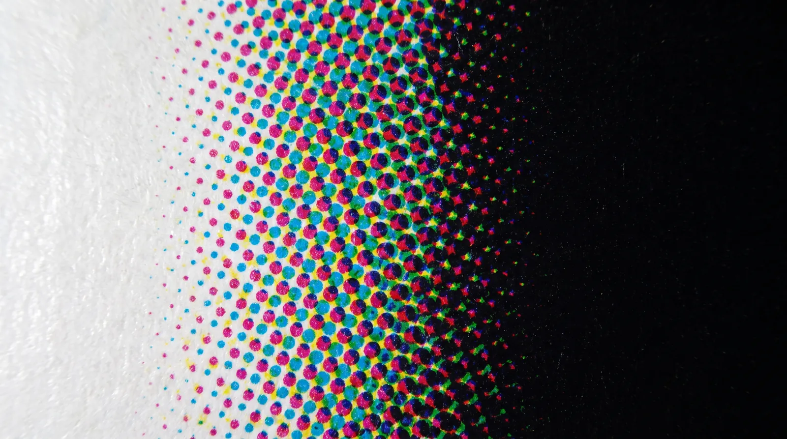
CMYK prints every color as a pattern of tiny dots in four translucent inks: cyan, magenta, yellow and black. Where dots overlap, the inks filter each other; where they sit side by side, your eye blends them at reading distance. A 30% tint is a field of dots covering 30% of the paper. A dark green is heavy cyan and yellow dots with some black. Nothing is premixed; every color is built on the sheet.
Offset and digital presses both work this way, whether the dots are ink or toner. The dot structure is why CMYK is good at photographs and soft gradients, and why it is weaker at the things a single spot ink does well: exact brand colors, flat solids and very small colored type. Each of the four plates also has to land on top of the other three, and that registration is the root of half the rules on this page.
Why your screen lies: RGB vs CMYK
Your screen mixes light; the press filters it, so some screen colors can't be printed at all. A monitor emits red, green and blue light and can show saturated colors that no combination of four inks on paper can reflect. Those colors are "out of gamut", and when the file is converted to CMYK they get pulled to the nearest color the press can make.
The colors that suffer most are the ones designers love on screen: electric and royal blues (which drift toward purple), screen greens and teals, and hot oranges. Skin tones, neutrals, earth tones and most muted palettes convert with little visible change. Uncoated paper shrinks the printable range further, because the ink soaks in and the surface scatters light.
The fix is to convert early, not at export. Set your document to CMYK from the start, using a profile that matches the stock (a coated profile for coated work, an uncoated profile for uncoated and cotton), and design inside what that profile can print. Turn on your app's soft proof or gamut warning. If a color is non-negotiable and it sits outside CMYK, that is a job for a spot ink, not a better conversion.
Coated, uncoated and cotton: how the paper changes CMYK
The same file prints darker, softer and flatter as the paper gets more absorbent. Ink on a coated sheet sits on the surface, so dots stay small and sharp. On uncoated stock the ink wicks into the fiber and each dot spreads, which printers call dot gain: midtones get heavier, shadows close up and fine detail softens.
| Stock | What the ink does | What you see | What to adjust |
|---|---|---|---|
| Coated (gloss, silk, matte coated) | Sits on the clay surface | Sharpest dots, widest color range | Build to a coated profile |
| Uncoated | Wicks into the fiber; dots spread | Flatter color, heavier midtones, softer detail | Build to an uncoated profile; reversed type 9 pt minimum |
| Cotton | Soaks in deeply; softest surface | Flattest color, softest edges | Keep CMYK for simple art; cotton suits letterpress and foil |
Cotton's natural processes are letterpress and foil. See also best papers for letterpress.
Paper color matters as much as coating. CMYK inks are translucent, so a cream or natural white sheet warms everything printed on it, and a tinted sheet darkens and dulls it. Build and judge color against the paper you're actually printing on; our paper library lists shade and surface for every stock.
Total ink coverage: 300% maximum
No point in your file may carry more than 300% total ink, adding C + M + Y + K together. Four plates at 100% each would be 400%. Paper can only absorb and dry so much ink before it misbehaves, and 300% is our ceiling on every stock.
Above the limit, three things go wrong. The ink stays wet long enough to transfer onto the back of the next sheet in the delivery stack (set-off). Heavy solids crack along folds and scores, because a thick ink film on a bent sheet has nowhere to go. And shadow detail in photographs fills in, because the dots in the darkest areas merge into one wet mass.
Profiles set their own ceilings, and the industry doesn't agree on one number: European ISO profiles sit around 300%, and the US GRACoL coated standard allows about 320%. Whatever profile you convert with, our limit is 300%. Converting images with a profile built for your stock usually keeps them under it; hand-built colors and pasted artwork are where excess ink sneaks in.
Rich black: the recipe and where it belongs
Our rich black is C60 M40 Y40 K100, and it belongs only in solid areas at least 5 mm across. K100 alone is a translucent black ink; across a large solid it reads as a dense charcoal, particularly on uncoated stock. Adding cyan, magenta and yellow underneath deepens it into a true black, at 240% total ink.
Never use rich black for type, fine lines, rules or small icons. Use K100. The reason is registration: rich black prints from four plates, and even a fraction of a millimeter of movement between them shows along every edge. On a large solid that fringe is lost in the mass. On a letter it is most of the stroke.
| Element | Black | Why |
|---|---|---|
| Body text, captions, small headlines | K100 | One plate; nothing to misregister |
| Fine lines, rules, hairlines, icons | K100 | Same reason; four plates would fringe |
| Barcodes and QR codes | K100 | Scanners need clean, single-plate edges |
| Solid areas, bars and backgrounds 5 mm across or larger | C60 M40 Y40 K100 | Deep black; any fringe is lost in the mass |
| Large display type (bold, big enough that strokes approach 5 mm) | Rich black is possible; K100 is safer | Judge by stroke width, not point size |
Keep one rich black recipe across the whole file. A K100 box beside a rich black box, or a photo's black beside a vector black, will visibly not match. And when a rich black solid sits next to K100 type on white, that's fine: the type is K100, the block is rich, and neither depends on the other's register.
The four-color black trap in placed images
Anything that arrives as RGB, including logos, screenshots, stock photos and exported charts, will convert its blacks to all four inks unless you intervene. Pure RGB black converts to a four-plate build that can sit above 300%. A logo placed as a JPEG sets its type in that build, and the text fringes exactly as in Fig. 3.
- Rebuild logos and type as vector artwork with K100 (or a named spot) wherever you can. Don't place logos as JPEG or PNG.
- Convert photographs to CMYK with a profile for your stock, which applies a total ink limit and a sensible black generation.
- Never color anything with the Registration swatch. It prints 100% on every plate, which is 400%; it exists for crop marks only.
- Check blacks in Separations Preview or Acrobat's Output Preview: hover over type and solids and read the four values.
Small type, fine lines and reversed type in CMYK
Positive type needs 6 pt or larger, reversed type 8 pt (9 pt on uncoated), positive lines 0.1 mm and reversed lines 0.2 mm. Those are our minimums for CMYK on digital and offset presses, and they assume the element prints from a single plate.
| Element | Minimum | Notes |
|---|---|---|
| Line, positive (ink on paper) | 0.1 mm (0.25 pt) | K100 or one solid color |
| Line, reversed (paper showing through ink) | 0.2 mm (0.5 pt) | Ink spread narrows it from both sides |
| Type, positive | 6 pt | Regular weight or heavier; no hairline serifs |
| Type, reversed | 8 pt | Coated stock |
| Type, reversed on uncoated | 9 pt | Ink spreads further into soft paper |
| Lightest tint | 8% | Below this, dots drop out unevenly |
Every process has its own floor. The full matrix is in minimum line weight and type size.
Reversed type is where CMYK fails first. Ink spreads into the paper from both sides of a white letter, so the letter gets thinner and its counters (the enclosed spaces in a, e, o) close up. If the field around it is built from four inks, each plate's slight movement adds colored slivers inside the letter edges.
Three habits keep small type clean. Set colored small type in a single solid (K100, or one spot color) rather than a four-color build. For gray type use a tint of black only, such as K60, not a CMY gray. And if type must reverse out of a color, build that color from as few plates as possible, or choose a medium or bold weight so the strokes have width to spare.
Tints, gradients and banding
No tint lighter than 8%, and treat long gradients on uncoated stock with suspicion. Below 8% the dots are so small that they print unevenly or not at all, so a pale background reads as speckle or vanishes.
Gradients have two failure points. A gradient that fades to paper can show a visible edge where the smallest dots stop printing; end it on a tint rather than at zero, or fade into an image. A long, smooth gradient across a large area can show steps (banding), more so on uncoated stock where dot gain exaggerates each step. Adding a little noise to the gradient in Photoshop breaks up the steps. Short gradients across small areas rarely cause trouble.
CMYK on dark or colored stock
CMYK doesn't show on dark dyed-through stock, so we don't print it there; use foil or white ink instead. Process inks are translucent, so on black or deep-colored paper there is no white underneath to reflect light back through them. The ink is technically on the sheet; you just can't see it.
FOIL
An opaque metal or pigment layer that sits on top of the stock. The standard answer for dark paper: gold, silver, copper and colored foils, or white pigment foil for a flat white. Follows the 0.6 mm (1.7 pt) foil minimum. See foil artwork preparation.
WHITE INK
An opaque white printed as its own layer, on the reserved WHITE swatch: 100%, own layer, set to overprint. Used on its own as a white, or as a base under color so the color reads on a dark sheet. Not offered on uncoated cotton; use foil or a blind deboss there. On dark paper, white is usually a foil job: white pigment foil. Opaque white ink is mainly for plastic and synthetic cards, covered in the UV printing guide.
For light-colored stock (natural, cream, kraft, pastel), CMYK prints but every color shifts toward the paper. If the design depends on clean light colors, start from a white sheet and print the background color instead.
Overprint vs knockout for black
Small K100 type and lines should overprint colored backgrounds; large black areas and anything white should not. By default a design app knocks out: the top object cuts a hole in everything beneath it. With black type on a colored background, that means a letter-shaped hole in the background, and any slip between plates shows a white sliver beside each letter. Overprinting the black lets the background print continuously underneath, so there is nothing to misregister.
OVERPRINT
K100 body text, rules and small icons over tints, color blocks and light images. InDesign overprints the [Black] swatch at 100% by default; in Illustrator, set it in the Attributes panel or with Overprint Black. The background darkens slightly under the black, which is invisible in small type.
KNOCKOUT
White objects, always: a white set to overprint disappears. Large K100 areas over images, where the picture would show through the translucent black. Light colors over dark ones. Rich black solids, which already carry their own underlayer.
Image resolution and exporting
Place photographs at 300 ppi at their final printed size and bitmap line art at 1200 ppi, then export a PDF/X-4. Resolution is measured after scaling: a 300 ppi image enlarged to 150% in the layout is effectively 200 ppi. Upscaling in software adds pixels, not detail. Vector artwork is always preferable for logos and line art.
- Document color mode CMYK, built for a coated or uncoated profile to match the stock; no RGB, no Lab
- Total ink at or under 300% everywhere, including placed images
- Rich black C60 M40 Y40 K100 only on areas at least 5 mm across
- All type, fine lines, barcodes and QR codes in K100 (or one spot color)
- Positive type 6 pt+; reversed 8 pt+ (9 pt on uncoated); lines 0.1 mm positive, 0.2 mm reversed
- No tint lighter than 8%
- No Registration swatch in the artwork; no white set to overprint
- Photos 300 ppi and line art 1200 ppi at final size
- 3 mm bleed on every edge that touches trim; copy 3 mm inside it
- Fonts outlined or fully embedded; exported as PDF/X-4 (PDF/X-1a accepted)
For the rest of the file checklist, including bleed, finish layers and swatch names, see print-ready files and our file requirements.
Output preview, ink limits and profilesAGENCY LEVEL
Verify total ink, black builds and overprint in the exported PDF, not in the layout file. The PDF is what reaches prepress; these checks tell you what it actually contains.
Checking total ink in Acrobat
In Acrobat Pro open Print Production, Output Preview. Set Preview to Separations, tick Total Area Coverage and enter 300. Everything above the limit highlights. Hover anywhere to read the C, M, Y and K values and the total at that point. The Preflight profile for ink coverage will list every offending object if you need a report for the rest of the team.
Choosing and embedding a profile
We convert every file to the press and paper it runs on, so you don't need to match a specific profile. What helps is sending CMYK built for the right kind of stock: a coated profile (FOGRA39 or PSO Coated v3 in Europe, GRACoL 2013 in the US) for coated work, and an uncoated profile (PSO Uncoated v3, FOGRA52) for uncoated and cotton. If you export PDF/X-4, embed the output intent so the file states which condition its CMYK was built for. Don't send untagged CMYK assembled from mixed sources; tell us which profile you designed to.
Overprint simulation and black separation
Turn on Simulate Overprinting in Acrobat's Output Preview (or Overprint Preview in InDesign and Illustrator) before you sign off. It shows the file the way separations will print it: a white object set to overprint vanishes, overprinting black shows its background through, and a finish layer (FOIL-GOLD, SPOT-UV) that should overprint doesn't knock a hole in the art. Then toggle the black plate alone: all small type should be on it, and on no other plate.
Rich black keep-away
When small reversed type has to sit inside a large rich-black field, the cleanest separation holds the C, M and Y plates back from the letter edges, so only the black plate defines the letterform and any slip happens inside a black edge instead of the white letter. It is standard prepress practice, but it needs to be deliberate. Leave it to prepress rather than building it yourself; we check every rich-black field with reversed type before the proof goes out.
More on File Setup & Prepress
How to Set Up Print-Ready Files: The Complete Checklist for Specialty Print
Read guide →Minimum Line Weight and Type Size for Every Print Process: Foil, Letterpress, Emboss, UV, CMYK and Die Cut
Read guide →Spot Color and Pantone for Print: Choosing, Specifying and Curating PMS Colors
Read guide →Continue reading
FILE SETUP
Spot Color and Pantone for Print: Choosing, Specifying and Curating PMS Colors
Read guide →FILE SETUP
Minimum Line Weight and Type Size for Every Print Process: Foil, Letterpress, Emboss, UV, CMYK and Die Cut
Read guide →FILE SETUP
How to Set Up Print-Ready Files: The Complete Checklist for Specialty Print
Read guide →FILE PREP
How to Prepare Your Artwork for Foil Stamping
Read guide →FILE SETUP
How to Prepare Files for Letterpress: Plates, Impression and Ink
Read guide →FILE SETUP
Combining Print Finishes: What Works Together, What Doesn't, and in What Order
Read guide →Send the file; we'll check the blacks
Start a custom quoteEvery file gets a prepress check for ink limits, black builds and type sizes before it's proofed.