FILE SETUP
Minimum Line Weight and Type Size for Every Print Process: Foil, Letterpress, Emboss, UV, CMYK and Die Cut
One table for every process we run, and the physics behind each number: why foil needs 0.6 mm, why reversed type needs more, and how to measure your file.
By Austin Terrill · Print Peppermint · 14 min
On this page
- The minimums matrix
- The rest of the minimums
- Why published minimums disagree, and why ours are conservative
- Hot foil: why the minimum is 0.6 mm
- Raised foil and raised spot UV: the same 0.6 mm rule
- Letterpress: fine lines hold, reversed lines close
- Emboss and deboss: the paper has to bend
- Flat spot UV: 0.3 mm lines, 0.5 mm gaps
- CMYK: the finest line, with two catches
- Die cutting and laser cutting: the minimums are distances
- Positive vs reversed: why reversed always needs more
- How type size relates to stroke thickness
- How to measure line weight in Illustrator and InDesign
- Common fails
- Before you send
The short answer: in hot foil, no line and no gap thinner than 0.6 mm (1.7 pt), and no type under 7 pt. Letterpress holds a much finer line, 0.15 mm (0.4 pt). Emboss and deboss need 0.5 mm (1.5 pt) strokes, 1 mm gaps and 10 pt type. Four-color printing holds 0.1 mm (0.25 pt) lines and 6 pt type. Reversed lines and reversed type, where the paper shows through ink or foil, always need more than positive ones. The full matrix is below, one row per process, and every number in it is the one we check your file against.
The minimums matrix
Find your process, then check the thinnest line in your file against the first column, the narrowest gap or reversed line against the second, and your smallest type against the next two. Registration is how far one layer can land from another, which tells you how tight a fit you can design.
| Process | Line (positive) | Gap / reversed line | Type (positive) | Type (reversed) | Registration |
|---|---|---|---|---|---|
| Hot foil | 0.6 mm (1.7 pt) | 0.6 mm | 7 pt | 10 pt | ±0.5 mm to print |
| Raised foil / raised spot UV | 0.6 mm | 0.6 mm | 8 pt | 10 pt | ±0.5 mm |
| Letterpress | 0.15 mm (0.4 pt) | 0.3 mm | 7 pt | 10 pt | ±0.3 mm color to color |
| Emboss / deboss | 0.5 mm (1.5 pt) | 1 mm | 10 pt | — | ±0.5 mm to print |
| Flat spot UV | 0.3 mm | 0.5 mm | 8 pt | — | ±0.5 mm |
| CMYK (digital / offset) | 0.1 mm (0.25 pt) | 0.2 mm (0.5 pt) | 6 pt | 8 pt (9 pt uncoated) | ±0.15–0.25 mm |
| Die cut (steel rule) | 0.25 pt cut line | 3 mm cut to cut | — | — | ±0.8 mm |
| Laser cut | 0.25 pt cut line | 1 mm · bridges 1 mm | — | — | ±0.5 mm between plies |
Positive: ink, foil or coating on bare stock. Reversed: bare stock showing through a solid of ink, foil or coating. Foil type assumes a low-contrast face (7 pt minimum, 8 pt recommended); high-contrast serifs need 12 pt in foil. Reversed foil and letterpress type must be medium or bold weight. 1 pt = 0.353 mm.
The rest of the minimums
| Process | Item | House spec |
|---|---|---|
| Hot foil | High-contrast serifs (Didone, fine hairlines) | 12 pt minimum |
| Hot foil | Two foils that don't touch | 1 mm apart minimum |
| Hot foil | Foil next to printed ink | 1 mm designed gap; ink knocked out under foil |
| Hot foil | QR codes, barcodes | Never foil. Always ink |
| Letterpress | Solid ink areas on cotton | Under 13 cm² (2 in²) |
| Letterpress | Halftones and gradients | Avoid; if unavoidable 85–100 lpi, no tints under 15% |
| Emboss / deboss | Type weight | Medium or bold, no hairlines |
| Emboss / deboss | Stock | Uncoated or cotton, 16 pt (0.4 mm) or heavier |
| CMYK | Lightest tint | 8% |
| CMYK | Rich black C60 M40 Y40 K100 | Only for areas at least 5 mm across |
| Die cut | Inside corner radius | 1.3 mm (0.05 in) minimum |
| Laser cut | Slot width | 0.8 mm minimum |
| Laser cut | Reveal (engrave through to a core color) | Lines 0.5 mm, gaps 0.4 mm |
Why published minimums disagree, and why ours are conservative
Search for the minimum line weight for foil and you'll find answers from 0.25 pt to 0.5 mm; letterpress minimums get quoted at 0.25 pt, 0.35 pt and 0.5 pt. Most of those aren't wrong. A shop running one foil on one smooth coated board can hold finer detail than a shop quoting for everything. But a designer reading the number can't see which conditions it assumed.
We run many foil series on stocks from coated board to soft, toothy cotton, and we'd rather publish one number that works on all of them than a best case that works on some. A finer figure you've seen elsewhere may well print there. Built to ours, it prints here, on any stock we offer, the first time.
Hot foil: why the minimum is 0.6 mm
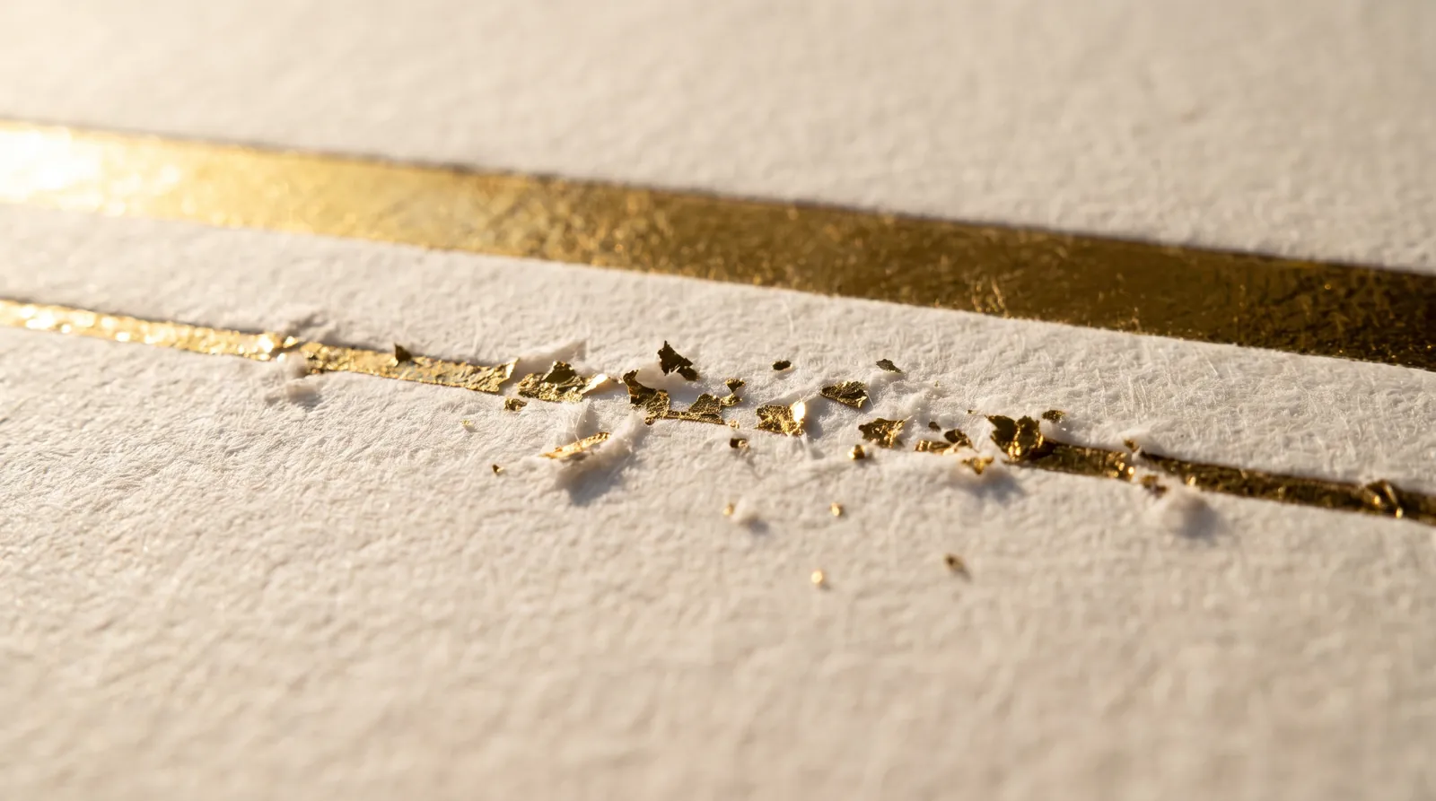
Foil lines and the gaps inside foil both stop at 0.6 mm (1.7 pt) because foil transfers by shearing a film, and a film needs room to break cleanly.
A heated metal die, with your artwork raised on its face, presses foil film against the sheet. Heat releases the foil from its carrier and bonds it to the paper only where the die touches. Everywhere else, the film has to tear along the edge of the die and lift away. Too-fine artwork fails in two ways:
- Thin lines break. A hairline gives the film almost no bonded area to hold on to while both edges tear, so it breaks up, skips or flakes. The finest ridges on a die are also the first to round over across a run.
- Narrow gaps fill in. Heat and pressure spread a little past the die edge. When two die faces sit closer than 0.6 mm, the film across the gap is heated and pressed from both sides and bonds there instead of lifting out. That's bridging: flecks first, then a solid bar where your counter used to be.
- Texture makes both worse. On cotton or a textured sheet the film spans the valleys between fibers, so edges are softer than on coated board. The 0.6 mm floor allows for that.
The type rows follow the same physics. 7 pt minimum for positive foil type, 8 pt recommended, in a low-contrast face. 10 pt minimum, medium or bold weight, for type reversed out of solid foil, because the paper-colored letters are gaps, and gaps fill in. 12 pt minimum for high-contrast serifs such as Didones, whose hairlines are far thinner than the stems. Foil registers to print within ±0.5 mm and to a second foil within ±0.25 mm. And QR codes and barcodes are never foil; the modules bridge and the code stops scanning. More in foil artwork preparation.
Raised foil and raised spot UV: the same 0.6 mm rule
Raised foil and raised spot UV follow the foil rule: lines and gaps 0.6 mm minimum, type 8 pt, reversed type 10 pt. Both build a thick layer of clear coating that flows before it cures. A narrow bead can't hold its height and slumps into a rounded smear; a narrow gap floods as the coating from each side meets in the middle. Both need a coated or laminated ground, and raised foil comes in gold, silver or holographic, one color per design.
Letterpress: fine lines hold, reversed lines close
Letterpress holds a positive line down to 0.15 mm (0.4 pt), but reversed lines and gaps need 0.3 mm, positive type 7 pt, and reversed type 10 pt in a medium or bold weight.
The photopolymer plate holds fine relief well, which is why letterpress suits delicate linework. What limits it is ink gain. The inked plate is pressed hard into the sheet, and the pressure squeezes a little ink outward from every printing edge. A positive stroke gains on both sides and gets slightly heavier, which it can afford. A reversed line or a counter loses on both sides and closes up, more so on soft cotton, where the impression pulls the ink along with the fibers.
Two more limits come with the ink. Keep solid areas under 13 cm² (2 in²) on cotton; a big flood bottoms out the plate and mottles. And letterpress ink is translucent, so light ink on dark stock isn't offered; use foil. Colors register within ±0.3 mm, with a 0.3 mm trap where they touch. Setup is in letterpress file setup.
Emboss and deboss: the paper has to bend
Emboss and deboss need strokes of at least 0.5 mm (1.5 pt), 1 mm between raised or recessed elements, and type at 10 pt minimum in a medium or bold weight, with no hairlines.
There's no ink here. The image is paper pushed up or pressed down between two metal dies, and you read it by the shadow along its edges, so the minimums are about how tightly paper fibers can bend. A stroke thinner than 0.5 mm becomes a crease, not a shape. Two forms closer than 1 mm merge, because the paper between them can't come back down in that distance. Small or light type has too little edge to cast a shadow, which is why blind type under 10 pt disappears on cotton.
Stock matters as much as art: uncoated or cotton, 16 pt (0.4 mm) or heavier, and 32 pt for a deboss that must not show through on the back. Emboss won't seat cleanly on soft-touch or silk laminate. Depth runs 0.3–1.0 mm. Details in emboss and deboss file setup.
Flat spot UV: 0.3 mm lines, 0.5 mm gaps
Flat spot UV holds a 0.3 mm line, needs a 0.5 mm gap and 8 pt type. The coating is a liquid laid on the sheet and cured under UV light; before it cures it flows a little, which rounds fine lines and closes narrow gaps. It registers to print within ±0.5 mm, so don't draw a UV outline that depends on a tighter fit: a gloss keyline 0.3 mm around a printed logo will visibly miss on one side. Spot UV soaks into uncoated and cotton stock, so it runs on coated or laminated stock only. See the spot UV guide.
CMYK: the finest line, with two catches
Four-color printing holds a 0.1 mm (0.25 pt) positive line and 6 pt type. Reversed, it needs 0.2 mm (0.5 pt) lines and 8 pt type, or 9 pt on uncoated stock.
- Catch one: misregistration. Cyan, magenta, yellow and black are four separate impressions, and they never land in exactly the same place. The matrix puts that at ±0.15–0.25 mm. A fine line or small letter built from four inks shows colored fringes when they drift. Build fine lines and small type in one ink, usually K100, and keep rich black (C60 M40 Y40 K100) for areas at least 5 mm across.
- Catch two: dot gain. Ink spreads as it hits paper, more on uncoated stock than coated. Reversed type out of a dark four-color background gets filled in from four directions at once. That's why reversed type needs 8 pt, and 9 pt on uncoated.
Keep total ink at 300% or less and the lightest tint at 8%. On dark dyed-through stock CMYK simply disappears; use foil or white ink. More in CMYK, rich black and ink limits.
Die cutting and laser cutting: the minimums are distances
A cut line has no printed weight; it's always a 0.25 pt stroke in the CUT swatch. What limits a cut is geometry: 1.3 mm (0.05 in) minimum inside corner radius, 3 mm between two cuts or between a cut and the trim, and a tolerance of ±0.8 mm across a stack.
A steel-rule die is a blade bent to your shape, and a blade only bends so tight, which is where the 1.3 mm inside corner comes from. Two cuts closer than 3 mm leave a strip of stock too narrow to survive, and it tears. Laser cutting is finer: 1.0 mm gaps between cuts, 1.0 mm bridges, 0.8 mm slots, a 3 mm frame to the card edge, and ±0.5 mm between plies. Any closed cutout, like the counter of an O, needs bridges or the center falls out. Setup is in die cut file setup and the laser cut file setup guide.
Positive vs reversed: why reversed always needs more
Every process spreads. Ink squeezes outward, foil bridges, coatings flow, paper fibers pull. Spread makes a positive stroke a little thicker and a reversed stroke a little thinner, so reversed lines and reversed type always need a larger minimum than positive ones.
POSITIVE
Ink, foil or coating on bare stock. Spread adds to the stroke on both edges, so the line prints slightly heavier than drawn. Counters inside letters (the eye of an e, the bowl of an a) are the part at risk: they're gaps, and they close.
REVERSED
Bare stock showing through a solid. The letter itself is the gap, so spread eats into every stroke from both sides. Thin strokes break up and small type fills in. That's why reversed type needs 10 pt in foil and letterpress, and a medium or bold weight.
How type size relates to stroke thickness
Point size measures the type body, not the stroke. The same 7 pt can mean a 0.15 mm stem or a 0.37 mm stem, depending on the weight.
| Weight | Stem at 7 pt | Stem at 10 pt | Size where the stem reaches 0.6 mm |
|---|---|---|---|
| Light | 0.15 mm | 0.21 mm | about 28 pt |
| Regular | 0.23 mm | 0.32 mm | about 18.5 pt |
| Bold | 0.37 mm | 0.52 mm | about 11.5 pt |
Other typefaces differ. To estimate any face: stem width in mm ≈ point size × 0.353 × the stem's share of the em. Measure your own face with the steps below.
That's why type has its own rows in the matrix. A letter is a set of short strokes tied into each other, and a small flaw in a 2 mm stem is far less visible than a break along a 40 mm rule. The foil type minimums, 7 pt positive and 8 pt recommended, assume a sturdy, low-contrast face; the 0.6 mm rule governs lines, rules, outlines, ornament and the gaps inside foil.
What the type rows don't forgive is a face's weakest stroke. A hairline serif, a thin crossbar or a swash that tapers to nothing behaves like a line, so treat it as one. In foil, avoid light weights at small sizes: at 7 pt their stems are a quarter of a foil line. And watch x-height; a small one sets smaller than its point size suggests.
How to measure line weight in Illustrator and InDesignHOW TO CHECK
Measure every line and gap at the size it prints, in millimeters. Never judge it by eye on screen.
- Set units to millimeters. Illustrator: Preferences > Units. InDesign: Preferences > Units & Increments.
- Work at final size. A logo placed at 40% in InDesign prints its strokes at 40% too, so measure the artwork at the size it will print, not the size it was drawn.
- Live strokes: select the path and read the weight in the Stroke panel. Check Scale Strokes & Effects: with it on, a 1 pt stroke on a logo scaled to 30% becomes 0.3 pt.
- Outlined shapes have no stroke weight to read. Use the Measure tool (grouped with the Eyedropper in both apps; the distance shows in the Info panel) across the narrowest point, zoomed to 800% or more, snapping to anchor points.
- Measure the gaps too: every counter, the space inside and between letters, between two lines, and between a line and a foil flood.
- Try the coin test: draw a 0.6 mm circle and slide it into every stroke and every gap in your foil art. If it doesn't fit inside a stroke, the stroke is too thin. If it doesn't fit inside a gap, the gap is too narrow.
- View at 100% (actual size) to judge how the detail reads, then go back to the numbers.
- Outline strokes on finish layers before export (Object > Path > Outline Stroke) so no stroke setting can change on the way out. Leave CUT and CREASE lines as strokes.
Common fails
- Script fonts. Entry strokes and the thin strokes that join letters are hairlines. In foil they break, and the word falls apart into loose letters. Choose a script with a heavier, more even stroke, or set it large enough that the joins clear 0.6 mm.
- Didone hairlines. Bodoni- and Didot-style faces have stems several times thicker than their hairlines. Foil needs 12 pt minimum for them; letterpress holds them far better than foil does.
- Thin-stroke icons. Icon sets drawn with 1 px strokes for screens become hairlines when scaled to 4 mm on a card. Rebuild them heavier, or print them in ink instead of foil.
- Tiny taglines under logos. The logo gets scaled to fit the card and the tagline beneath it drops to 4 or 5 pt. Check the tagline on its own; set it separately at the minimum, or leave it off.
- QR codes in foil. Never. The modules bridge, the quiet zone fills, and the code stops scanning. QR codes and barcodes are always ink.
- Hairline keylines and borders. A 0.25 pt frame is fine in CMYK and fails in foil, emboss and UV. In foil it needs 1.7 pt.
- Foil art reused for emboss. When foil and emboss share one combination die, the stricter number wins on every measure: 0.6 mm lines from foil, 1 mm gaps and 10 pt type from emboss. A mark that passes as foil can fail as emboss.
Before you send
- Every foil line, rule and outline is 0.6 mm (1.7 pt) or more
- Every gap, counter and knockout inside foil is 0.6 mm or more
- Foil type is 7 pt or more positive (8 pt recommended), 10 pt medium or bold reversed, 12 pt for high-contrast serifs
- Letterpress lines 0.15 mm, reversed lines 0.3 mm, type 7 pt / 10 pt reversed
- Emboss strokes 0.5 mm, gaps 1 mm, type 10 pt medium or bold
- Flat spot UV lines 0.3 mm, gaps 0.5 mm, type 8 pt
- CMYK lines 0.1 mm, reversed 0.2 mm; type 6 pt, reversed 8 pt (9 pt uncoated)
- Die cut inside corners 1.3 mm radius or more; cuts 3 mm apart and from trim
- Measured at final size, with strokes outlined on finish layers
- No QR codes or barcodes in foil
More on File Setup & Prepress
How to Set Up Print-Ready Files: The Complete Checklist for Specialty Print
Read guide →Spot Color and Pantone for Print: Choosing, Specifying and Curating PMS Colors
Read guide →Four-Color Process (CMYK) for Print: Rich Black, Ink Limits and Why Your Screen Lies
Read guide →Continue reading
FILE SETUP
How to Set Up Print-Ready Files: The Complete Checklist for Specialty Print
Read guide →FILE PREP
How to Prepare Your Artwork for Foil Stamping
Read guide →FILE SETUP
How to Prepare Files for Letterpress: Plates, Impression and Ink
Read guide →FILE SETUP
How to Set Up Files for Embossing and Debossing
Read guide →FILE SETUP
How to Set Up a Die Line: Die-Cut and Custom-Shape Files
Read guide →FILE SETUP
Four-Color Process (CMYK) for Print: Rich Black, Ink Limits and Why Your Screen Lies
Read guide →Not sure your linework will hold? Send it and we'll measure it.
Start a custom quoteEvery file is checked against these minimums before it's proofed, and nothing goes to press until you approve.
How to set up print-ready files · Foil artwork preparation · File requirements