FILE SETUP
From AI Mockup to Print File: Printing a ChatGPT, Midjourney or Canva Design
An AI image is a picture of a card, not a file a press can use. What breaks when you send one straight to print, what has to be rebuilt, and how to brief the rebuild so the printed piece looks like the one you fell for.
By Austin Terrill · Print Peppermint · 9 min
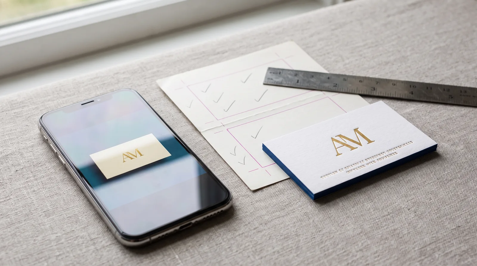
The short answer: an AI-generated design is a good brief and a bad print file. ChatGPT, Midjourney, Gemini and Canva's image tools produce a flat raster picture: type drawn as pixels, colors in RGB, and finishes like foil or letterpress painted on as light and shadow. A press needs vector shapes, real fonts, named colors and one layer per finish. So the image gets rebuilt, element by element, and you approve a proof of the rebuild before anything is made.
That isn't a knock on the tools. An AI render is the fastest way to show a printer what you want, and more customers now start there than anywhere else. The mistake is treating the render as the finished file. This guide covers what breaks, what gets rebuilt and how to brief it so the printed piece keeps what you liked.
| Element | In the AI image | What the press needs |
|---|---|---|
| Type | Letters painted as pixels; spelling and digits drift | Real fonts, set from your typed text, outlined |
| Logo or mark | Raster; soft edges; details that dissolve at card size | Clean vector, line weights above the finish minimum |
| Foil | A painted gold gradient with highlights | One flat vector shape, 100% of one `FOIL-<COLOR>` swatch |
| Letterpress, emboss | A drawn shadow | A vector shape on its own layer; the press makes the depth |
| Color | RGB, with glow and lighting baked in | CMYK, or named Pantone swatches |
| QR code | A pattern that looks like a code and doesn't scan | A real code generated from your URL, in ink |
| Size and bleed | Whatever the model chose, often not a real card size | Artboard at trim, 3 mm bleed, 3 mm safety |
| Paper | A texture effect | A real stock that suits every finish on the card |
Full file rules: print-ready files.
Why an AI image can't go straight to press
Every specialty finish is made from a shape. A foil die is etched from the foil shape, a letterpress plate from the ink shape, an emboss die from the raised shape. A die maker needs that shape as a vector path, on its own layer, filled with one named swatch. An AI image has no shapes. It has pixels that happen to look gold, or shaded, or raised.
- Painted foil isn't foil. The model draws gold as a gradient with highlights. Foil is one flat metal film, so a gradient becomes one solid tone, and highlights disappear. If the look depends on the shine, it needs a different idea.
- Painted depth isn't depth. A drop shadow that says "letterpress" or "emboss" is a drawing. The press makes the depth from a flat shape on its own layer.
- Painted texture isn't paper. The fibers in the render are an effect. The real stock decides what the finishes can do, and some combinations the model loves can't be made, such as spot UV on cotton.
- Upscaling doesn't help. A 4× upscale is a bigger picture of the same soft edges. It still isn't vector and still can't make a die.
The type problem: check every character
Image models draw letters; they don't set text. The result looks right at a glance and fails on the details: a digit swapped in a phone number, a missing letter in an email, a URL with the wrong domain ending, a street name that doesn't exist. The model also defaults to the same handful of fashionable typefaces, which is part of why so many AI cards look alike.
Small type is also where the finish minimums bite first. The model will happily render 5 pt contact details in foil or reversed out of a dark background. Foil type needs 7 pt at least (8 pt recommended, 10 pt reversed), letterpress 7 pt, emboss and deboss 10 pt, and CMYK 6 pt. The full list is on minimum line weight and type size.
The logo: rebuild, don't trace
An auto-trace of an AI logo gives you a vector file, technically. It also gives you lumpy curves, hundreds of stray points, near-symmetry that isn't quite symmetric, and hairlines that vanish at the printed size. For foil and letterpress, the logo is rebuilt by hand: clean curves, real type where there's lettering, and every line and gap checked against the finish at its real width.
- Measure at the printed size. A mark that looks bold at 1000 px across may be 18 mm wide on the card. At that size, a fine line in the render can be 0.2 mm, a third of the 0.6 mm foil minimum.
- Fix the design, not just the lines. When a mark has more detail than the size allows, thickening everything makes it clumsy. Removing detail usually looks better than bolding it.
- Keep what you liked. Tell us which part of the image made you pick it: the shape, the monogram, the layout, the color. That's what the rebuild protects.
Color: screen glow doesn't print
AI images are RGB and lit like a product shoot: bright highlights, glowing color, deep shadows. Paper reflects light instead of emitting it, so saturated screen colors print duller, and the lighting that made the render look rich doesn't exist on the card. We convert process color to CMYK or match it to a named Pantone swatch, uncoated for cotton and uncoated stock. See spot color and Pantone and CMYK, rich black and ink limits.
- Black backgrounds. A render's black is usually a flat RGB black. On press, large black areas use a rich black build; small type and fine lines use 100% black only, or they print fuzzy.
- Dark paper. The model will show white text on black cotton. White ink isn't offered on uncoated cotton; white pigment foil or a blind deboss does the job.
- Metallic ink effects. A shimmering color in the render is either foil or a flat ink. Pick one; a printed gradient won't shine.
QR codes: always generated, always ink
The QR code in an AI image is decoration. It has the look of modules and finder squares and no data. We generate a real code from your URL, set it in ink at a size that scans, and keep foil at least 1 mm away. Never foil a QR code: scanners need flat, high-contrast modules, and foil reflects. Scan it from the proof with your own phone before you approve.
Finishes the render invented
Image models combine finishes freely. Some of their combinations can't be made, and some can only be made one way. The common ones:
| What the render shows | What happens in production |
|---|---|
| Rounded corners and a painted edge | Painted edges need square corners. Keep one, or use a colored core ply for the edge |
| Spot UV gloss on cotton | Spot UV soaks into cotton and doesn't cure. Use foil or a blind deboss for the same shape |
| White text on black cotton | No white ink on uncoated cotton. Use white pigment foil or blind deboss |
| Foil gradient or glow | Foil is one flat tone per foil color |
| Foil on top of printed ink | Foil lands on bare paper; ink is knocked out underneath with a 1 mm gap |
| A die-cut shape with painted edges | Shaped cuts and painted edges aren't compatible |
| Hairline foil borders | Thickened to 0.6 mm, or dropped |
How finishes stack, and in what order: combining print finishes.
How to brief the rebuild
Send the image and this list. The more of it you give us, the closer the first proof lands.
- The AI image, plus any other versions you liked
- Every word typed out exactly as it should print: names, titles, phone, email, URL, address, handles
- Which elements should be foil, letterpress, emboss or deboss, or plain ink
- Card size and paper if you know them; if not, say how thick and how it should feel
- Your existing logo file (AI, EPS, SVG or PDF), if you have one. It beats a redraw
- The URL for any QR code
- The one thing about the image you don't want to lose
Our own Studio works the same way: it shows you directions in a couple of minutes, and a designer rebuilds the one you pick as real print artwork. If you're setting up the file yourself instead, start with print-ready files and the 15 file problems we fix most often.
What you'll see on the proof
- The rebuilt artwork at the real card size, front and back.
- Every finish called out: which elements are foil, ink, letterpress, emboss or deboss.
- Any change we made to meet a minimum, with the number: "the border is now 0.6 mm", not "we adjusted it".
- The text, set from what you typed. Check it letter by letter and scan the QR code.
More on File Setup & Prepress
How to Set Up Print-Ready Files: The Complete Checklist for Specialty Print
Read guide →15 Print File Problems We Fix Most Often (and How to Avoid Them)
Read guide →Minimum Line Weight and Type Size for Every Print Process: Foil, Letterpress, Emboss, UV, CMYK and Die Cut
Read guide →Continue reading
FILE SETUP
How to Set Up Print-Ready Files: The Complete Checklist for Specialty Print
Read guide →FILE SETUP
15 Print File Problems We Fix Most Often (and How to Avoid Them)
Read guide →FILE SETUP
Minimum Line Weight and Type Size for Every Print Process: Foil, Letterpress, Emboss, UV, CMYK and Die Cut
Read guide →FILE SETUP
Spot Color and Pantone for Print: Choosing, Specifying and Curating PMS Colors
Read guide →FILE PREP
How to Prepare Your Artwork for Foil Stamping
Read guide →FILE SETUP
Combining Print Finishes: What Works Together, What Doesn't, and in What Order
Read guide →FILE SETUP
Four-Color Process (CMYK) for Print: Rich Black, Ink Limits and Why Your Screen Lies
Read guide →Have an AI mockup you love? Send it with your text.
Start a custom quoteA designer rebuilds it as print artwork, and nothing is made until you approve the proof.
Print-ready files · 15 common file problems · How proofing works