FILE SETUP
Designing for Painted Edges: Thickness, Corners and Color
Edge paint needs thick board, square corners and a Pantone U reference, and it changes what your art can do near the trim. The rules, and why the clamped stack sets every one of them.
By Austin Terrill · Print Peppermint · 11 min
On this page
- What edge painting is
- How thick does a card need to be for edge painting?
- Square corners and straight cuts only
- Choosing the edge color
- Painted edge vs colored core: two different techniques
- Art near a painted edge: the 3 mm rule
- Design a clean border, not a hairline at the edge
- Edge foil vs edge paint
- Double-sided designs and orientation
- Choosing the stock
- How to set up a file for a painted-edge card
- Caliper math, tolerance and specifying the edge
- Caliper points are not type points
- Tolerance stack-up at the trim
- Writing the spec line
The short answer: edge painting colors the cut edges of thick cards by clamping the finished stack square and painting across it as one block. You need 32 pt (0.8 mm) board at minimum and 48 pt (1.2 mm) for an edge that reads as a feature, square corners and straight cuts only, and a Pantone U reference for the color. Keep foil and critical art 3 mm inside the trim. Only background ink may bleed into a painted edge; foil never does.
You don't draw a painted edge in your file. It's a property of the stack, not of any one card, and that is exactly why it constrains the design: the shape, thickness and outer 3 mm of your card all have to suit a block of cards being clamped and painted together. For how thickness is built in the first place, see business card thickness.
| Item | House spec | Why |
|---|---|---|
| Minimum caliper | 32 pt (0.8 mm) | Thinner edges can't hold a clean line of paint |
| Edge that reads as a feature | 48 pt (1.2 mm) | A band of color, not a thread |
| Corners and shape | Square corners, straight cuts only | The stack is clamped and painted as a square block |
| Edge color | A Pantone U reference | Paint on cotton reads slightly deeper than the chip |
| Foil and critical art | 3 mm or more inside trim | Paint laps the face; the cut moves |
| What may bleed into the edge | Background ink only | Paint covers the cut edge of the ink |
| Foil into a painted edge | Never | Paint doesn't bond to foil film |
| Cutting tolerance | ±0.8 mm across a stack | Why nothing precise lives near the trim |
All figures from our house spec. The die-cutting rules that interact with edge painting are in die cut file setup.
What edge painting is
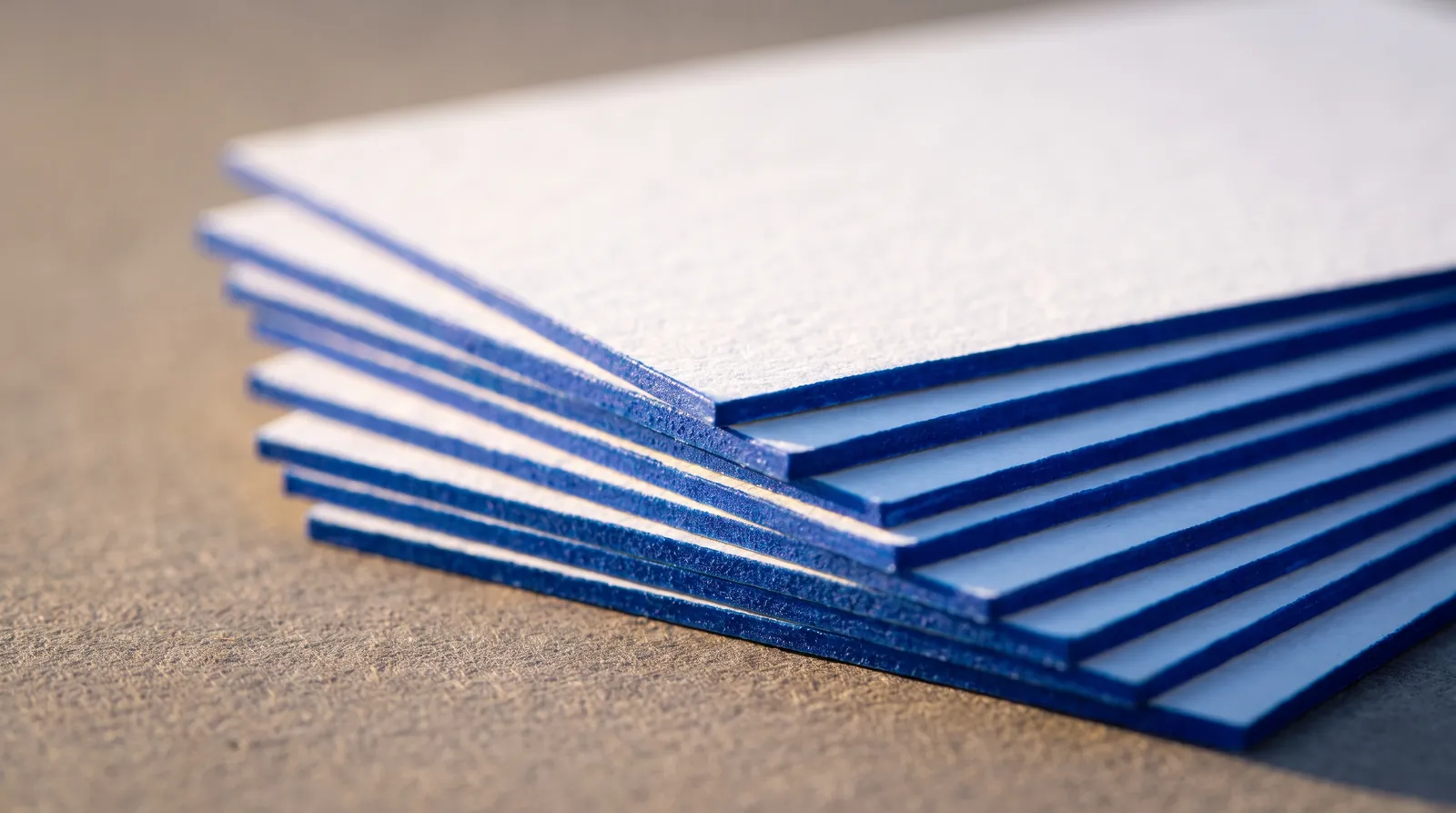
Edge painting is color applied to the cut edges of a finished stack of thick cards. The cards are printed, finished and trimmed, then jogged square into a block and clamped hard between boards so nothing can creep between the sheets. The paint goes on by hand across the exposed edges of the whole block at once. Released from the clamp, every card carries the same line of color around its edge.
Edge painting is the last operation on the piece, after print, foil, impression and trimming; our guide to combining print finishes shows the full order. Everything that follows comes from that picture: the edge has to be thick enough to paint, flat enough to clamp, and far enough from your artwork that paint and art don't meet.
How thick does a card need to be for edge painting?
32 pt (0.8 mm) is our minimum for a painted edge, and 48 pt (1.2 mm) is where the edge starts to read as a feature rather than a detail. A single 16 pt (0.4 mm) sheet has too little edge to hold a clean line of paint. At 32 pt, a duplex of two plies, you get a clear line of color in the hand; a credit card is about 30 pt, so that's the feel. At 48 pt, a triplex, the edge is a band you notice from across a table. Honestly, 48 pt is a little hard to slide into a wallet; it earns its place when the edge is the point of the design.
| Caliper | Thickness | Typical build | Painted edge |
|---|---|---|---|
| 16 pt | 0.4 mm | Single ply | Not offered: too little edge |
| 32 pt | 0.8 mm | Duplex, two plies | The minimum: a clear line of color |
| 48 pt | 1.2 mm | Triplex, three plies | A feature: a band of color |
Caliper points are thousandths of an inch: 32 pt is 0.032 in. They are not type points. More on builds in business card thickness.
Square corners and straight cuts only
Painted edges need square corners and straight cuts; rounded corners and die-cut shapes can't be painted cleanly. The stack is trimmed square as a block, so every card's edge lies in one flat plane, and clamp pressure closes the sheets tight against each other. The brush runs along a flat surface and stops at a crisp corner.
A rounded corner breaks that. Corners are cut after trimming, in lifts, and the arcs never line up exactly from card to card. The painted corner becomes a ribbed surface, the brush has to turn a curve it can't hold flat against, and paint catches in the steps, creeps between sheets and lands on the faces. A die-cut shape is the same problem all the way around. Our die-cutting spec lists shaped cuts and edge painting as not compatible; see die cut file setup.
Choosing the edge color
Specify the edge color as a Pantone Uncoated (U) reference, and expect paint on cotton to read slightly deeper than the chip. The cut edge of a cotton board is raw fiber; it drinks the paint in, and color that soaks in reads more saturated than the same color sitting on a printed swatch. If you're torn between two neighboring chips, take the lighter one.
- Matching the face. We can match the edge to the same Pantone as your letterpress ink. Ink on a face and paint on an edge are different materials on different surfaces, so expect close, not identical, with the edge usually a touch deeper.
- Contrasting the face. A bright edge on a white or natural card is the classic move: quiet faces, loud profile. It works best at 48 pt, where the edge has room to carry the color.
- Tonal. An edge a shade darker than a colored ply makes the whole card read as one solid object.
- Dark stock. Paint struggles to cover a black or deeply dyed core cleanly. On dark stock the edge usually goes to foil instead, checked case by case.
Pick the reference from a physical U guide against a sample of the actual paper; the spot color and Pantone guide explains why screen color can't be trusted here, and the sample pack puts the actual boards in your hand.
Painted edge vs colored core: two different techniques
A painted edge is color added to the cut edge after trimming; a colored core is a dyed ply built into the board, so the color is the paper itself. They look related from across a room and behave completely differently in production.
PAINTED EDGE
Paint applied to the trimmed stack. Any Pantone U reference. One solid color that covers the ply seams. Square corners and straight cuts only. Faces can be any paper color.
COLORED CORE
A dyed ply laminated into a duplex or triplex board. Color limited to the papers available. Shows as a stripe between white faces (triplex) or as two bands (duplex). Follows any cut: rounded corners and die-cut shapes are fine.
Choose paint when you need an exact brand color on the edge, or a color no paper comes in. Choose a colored core when the card has rounded corners or a shaped cut, when you like the stripe, or when a duplex back ply is doing double duty as the back color. Don't pay for both: paint covers the core completely. The paper library shows the colored plies available.
Art near a painted edge: the 3 mm rule
On a painted card, keep foil and critical art at least 3 mm inside the trim, and never bleed foil into a painted edge; background ink is the only thing allowed to run off. Three things happen in that outer 3 mm. The stack is cut at ±0.8 mm, so anything precise near the trim moves from card to card. The paint laps and wicks a hair onto the face. And the brush works right at the edge, where any foil that runs off the trim would sit.
Why background ink is fine. A flood of ink that bleeds 3 mm (0.125 in) past trim is absorbed into the sheet. After trimming, its cut edge sits under the paint, which covers it. Bleed it properly and you get color right to the painted edge with no white sliver. Why foil isn't. Paint doesn't bond to foil film, so where foil meets the edge the paint line breaks up, and the foil picks up paint along its cut edge. The foil rules for trims are in foil artwork preparation.
Design a clean border, not a hairline at the edge
On uncoated and cotton stock the paint wicks a hair onto the face. It reads as a fine line of color hugging the trim, which is part of the look, but it means anything drawn right at the edge gets tinted. Combine that with a ±0.8 mm cut and a thin frame printed near the trim looks uneven from card to card, now with a strong line of paint running beside it for comparison. Give the edge a clean margin instead, or bleed the background color off entirely.
Edge foil vs edge paint
Edge foil is metallic film pressed onto the edge instead of paint: it reads as metal, not color, and it follows the same square-corner, straight-cut rule. It is stricter about the surface. Foil needs a firm, smooth surface to release onto, and the cut edge of a cotton board is soft and fibrous. We treat edge foil on cotton as a case-by-case production check, so ask before you design around it, and have edge paint as the fallback.
Double-sided designs and orientation
A painted edge belongs to both faces at once, so choose its color against the front and the back together. The process doesn't care whether your card is portrait or landscape; the edge normally runs the same color all the way round. What matters is how the three surfaces meet.
- A colored back. If the back is a flood of one color or a colored ply, matching the edge to it makes the card read as a solid block with a white face.
- A two-color duplex. Paint covers the seam, so you lose the two-tone edge. Keep the plies visible or paint them; not both.
- Keep-clear on both faces. The 3 mm rule applies to the front and the back. A back designed edge to edge with foil breaks it just as a front would.
- Letterpress on both sides. A painted card is at least 32 pt duplex anyway, which is also what deep two-sided letterpress needs. See letterpress file setup.
Choosing the stock
Cotton and other uncoated boards take paint with a soft line and a slight wick; smoother, closed-surface sheets hold a crisper line. Cotton duplex and triplex are the classic painted-edge boards because they pair with letterpress, which wants the same soft, thick sheet. The core color matters as much as the face: light paint over a white core stays bright, while paint over a dyed core picks up its tone. Browse builds in the paper library, and see best papers for letterpress if the faces are pressed too.
How to set up a file for a painted-edge card
- Artwork at the exact trim size, with square corners. No rounded-corner or shaped CUT path.
- Caliper chosen: 32 pt (0.8 mm) minimum, 48 pt (1.2 mm) if the edge is the feature.
- Background ink that should reach the edge bleeds 3 mm (0.125 in) past trim.
- Foil, fine rules, small type and anything critical at least 3 mm inside trim, on both faces.
- No foil bleeding off any edge.
- No hairline frames or fine detail hugging the trim.
- Edge color given as a Pantone U reference in the order notes, not drawn into the artwork.
- Front and back supplied as separate pages at the same trim size.
- Exported as PDF/X-4. PDF/X-1a and native AI are accepted.
The general file rules that apply to every job are in how to build a print-ready file and on our file requirements page.
Caliper math, tolerance and specifying the edgeAGENCY LEVEL
Caliper points are not type points
Board caliper in points is thousandths of an inch: 32 pt is 0.032 in, about 0.8 mm, and 48 pt is about 1.2 mm. A type point is 0.353 mm. Mixing them up is how spec sheets end up asking for a 32 pt card as if it were 11 mm thick. When you brief a team or a supplier, give caliper in mm with the pt figure in parentheses, and say how many plies.
Tolerance stack-up at the trim
The cut moves ±0.8 mm across a stack. With art held 3 mm inside the trim, the worst case still leaves 2.2 mm of clear margin, which is why 3 mm is the number. A border drawn exactly 3 mm in will read anywhere from 2.2 mm to 3.8 mm wide depending on the card, and a painted edge makes the difference easier to see because it draws a hard line parallel to the border. If a frame is part of the design, make it heavy enough and far enough in that a 0.8 mm shift reads as nothing.
Writing the spec line
One line in the order notes is enough: build, caliper, edge treatment, edge color, corners. For example: Triplex cotton, 48 pt (1.2 mm). Edge: paint, PANTONE 805 U. Square corners. Paint color can't be proofed on screen; the U chip is the reference, and on cotton the edge will read slightly deeper. If the color is critical, judge it against a physical sample before you sign off. How proofing works covers what we check before production.
More on File Setup & Prepress
How to Set Up Print-Ready Files: The Complete Checklist for Specialty Print
Read guide →Minimum Line Weight and Type Size for Every Print Process: Foil, Letterpress, Emboss, UV, CMYK and Die Cut
Read guide →Spot Color and Pantone for Print: Choosing, Specifying and Curating PMS Colors
Read guide →Continue reading
PAPER
Business Card Thickness Explained
Read guide →FILE SETUP
Combining Print Finishes: What Works Together, What Doesn't, and in What Order
Read guide →FILE SETUP
How to Prepare Files for Letterpress: Plates, Impression and Ink
Read guide →FILE SETUP
How to Set Up a Die Line: Die-Cut and Custom-Shape Files
Read guide →FILE SETUP
Spot Color and Pantone for Print: Choosing, Specifying and Curating PMS Colors
Read guide →FILE PREP
How to Prepare Your Artwork for Foil Stamping
Read guide →FILE SETUP
How to Set Up Print-Ready Files: The Complete Checklist for Specialty Print
Read guide →PAPER
Best Papers for Letterpress Printing
Read guide →Planning a painted edge?
Start a custom quoteTell us the build, the edge color and the corners. We check the file against this spec before anything is trimmed.
Business card thickness · Combining print finishes · Paper library