Design exercise · Labels · Print Peppermint
Three ways to get a white sticker off brown kraft
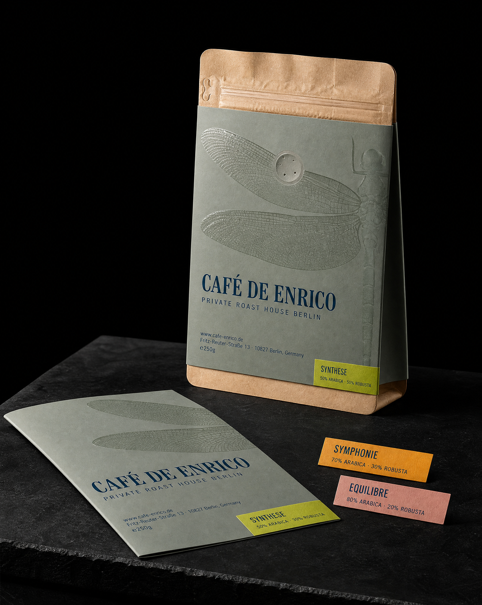
An unsolicited redesign of a Berlin roast house's 250g pouch, explored as three producible directions. The dragonfly and the roast-house line stay in all three; the white inkjet label island is what each one attacks. No change to the pouch, the zipper, the valve or the fill line.
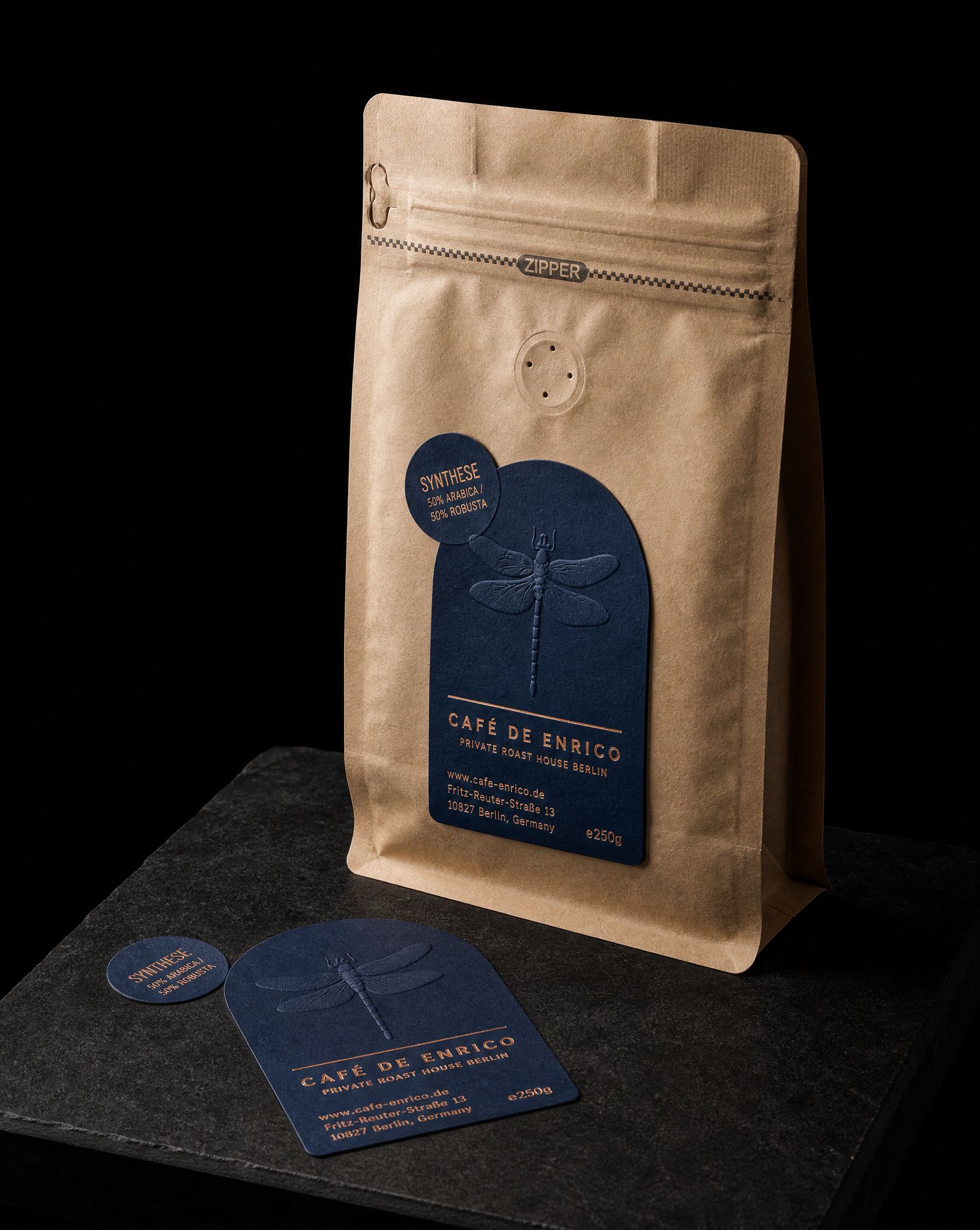
The idea
Café de Enrico is a private roast house on Fritz-Reuter-Straße in Berlin-Schöneberg, and it is Austin's local. He has bought their coffee for years, and for years he had the same quiet thought every time a bag landed on the counter: the roasting is careful, the service is careful, and the packaging is a white inkjet label with a yellow dot on it.
Five rules
- 01Name the actual problem. Leave the dragonfly and "PRIVATE ROAST HOUSE BERLIN" untouched, keep every line of copy verbatim, and treat the white label island as the o…
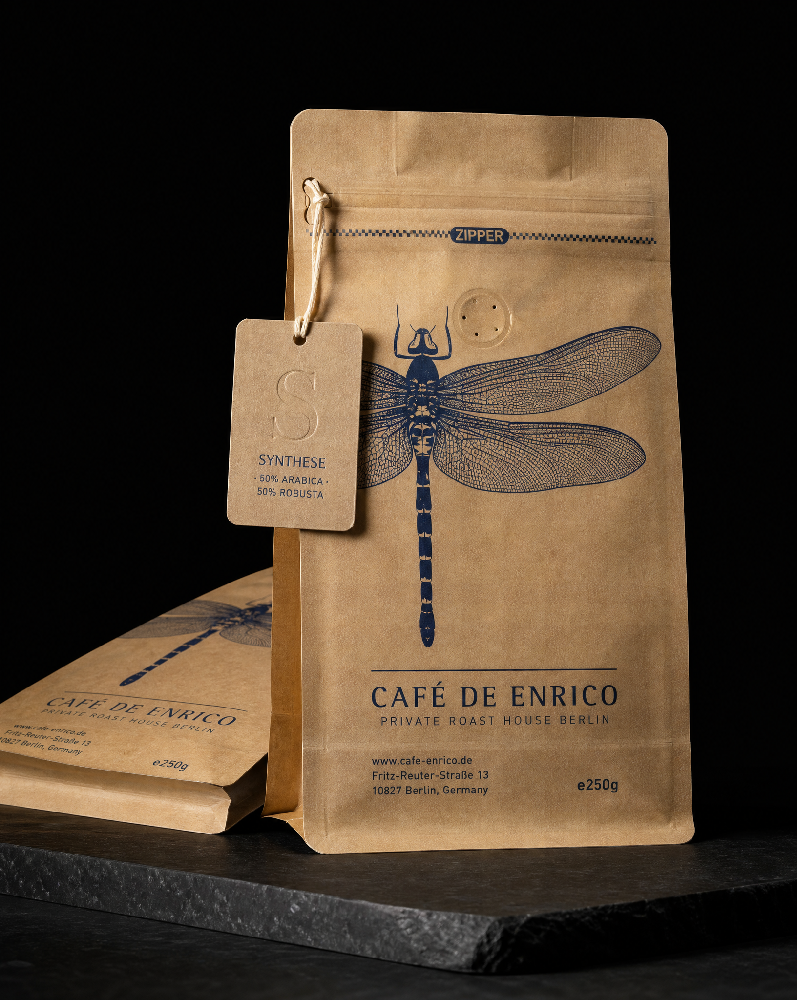
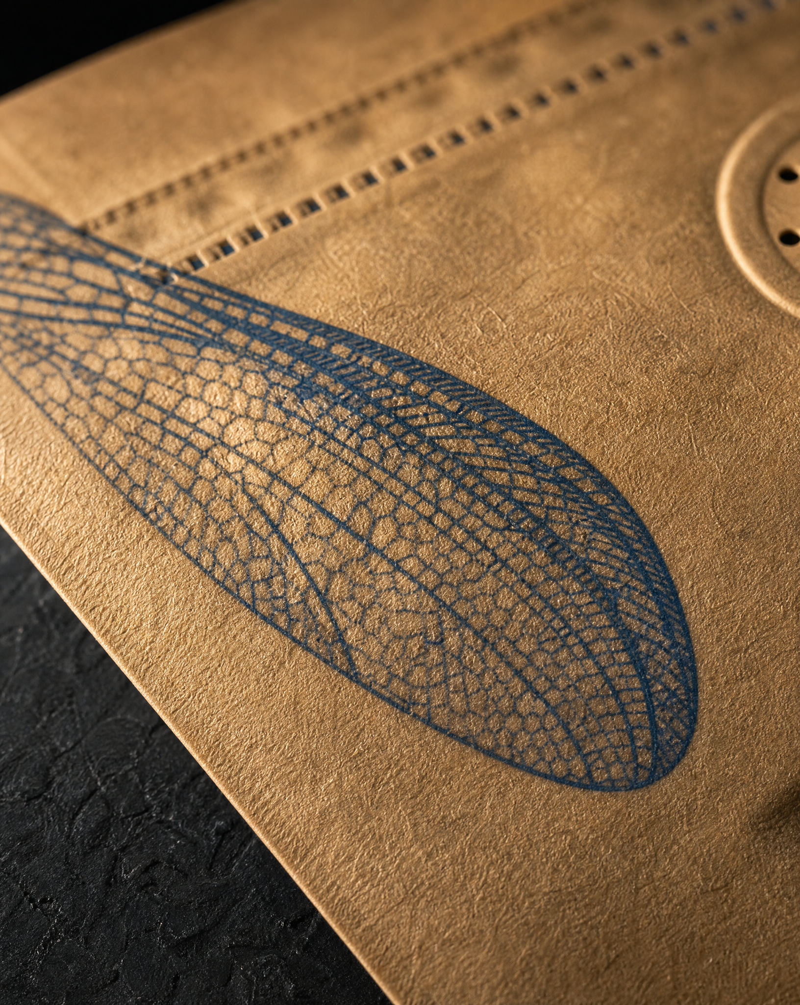
- 02Look 1: kill the label entirely. One Prussian blue ink printed direct on the kraft, with the dragonfly redrawn as an engraved line block running the full height and bleedin…
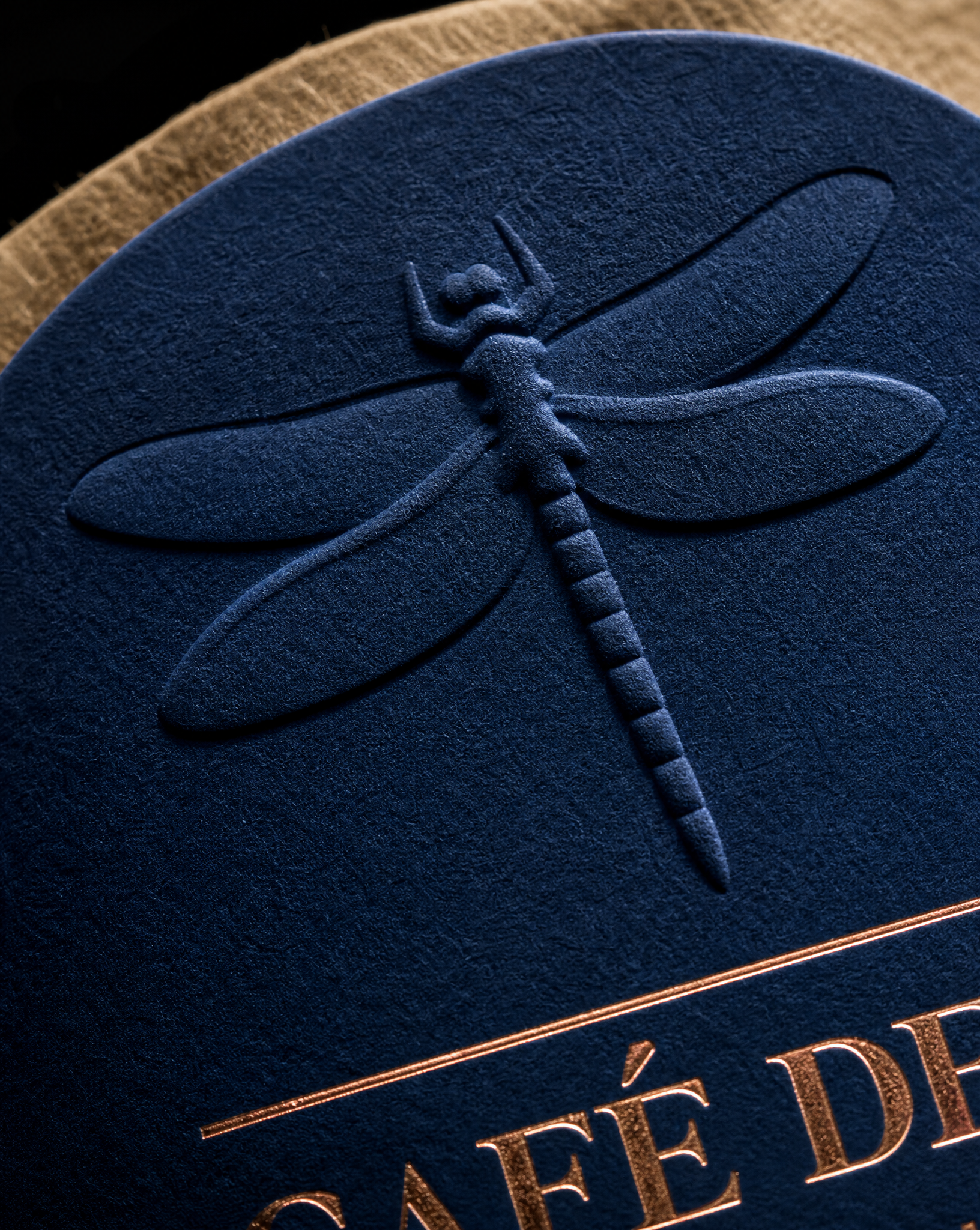
- 03Look 2: make the label an object. Bare kraft, then a 3 × 4.5 in arch die-cut label on deep Prussian blue uncoated: the dragonfly as a multi-level blind emboss with no ink at…
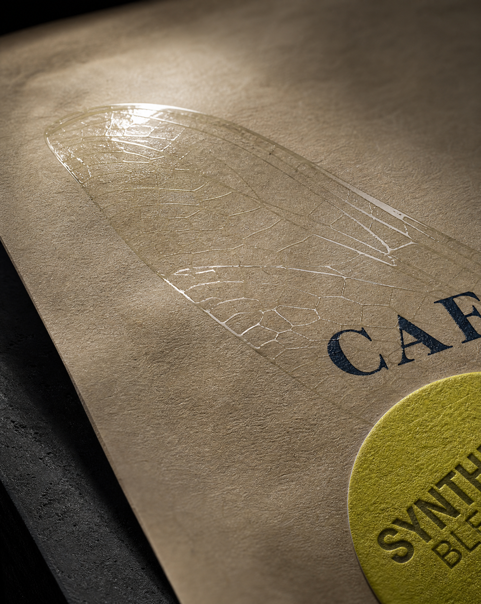
- 04Look 3: let the mark become the surface
- 05Nothing upstream changes. All three directions keep the existing pouch, hardware and fill line. The only variable is what gets printed, applied or stamped.
Why we did this
Nobody asked for this. Austin took it on himself as creative charity, in the way printers sometimes redesign the thing they look at every morning. The brief was his own: keep everything the roaster has earned, change only what is letting them down, and cost it three ways so it is a real option rather than a flattering mockup.
The dragonfly stays. The roast-house line stays. Every address, URL and weight stays exactly as set. What changes is the surface it all sits on.
How to choose
Look 1 is the cheapest per unit at volume, because there is no label to buy, die or apply.
Look 2 buys the most perceived value per euro spent, because emboss and foil on coloured stock is the finish combination customers read as expensive.
Look 3 scales best across a blend range, because the only variable per SKU is a small chip label.
Copy held verbatim in all three: CAFÉ DE ENRICO · PRIVATE ROAST HOUSE BERLIN · www.cafe-enrico.de · Fritz-Reuter-Straße 13 · 10827 Berlin, Germany · e250g · SYNTHESE BLEND · 50% ARABICA / 50% ROBUSTA.
Start from these materials
Same paper, foil and finish, locked in — nothing of this piece artwork comes with it.
Redesigned by Austin Terrill, founder.